
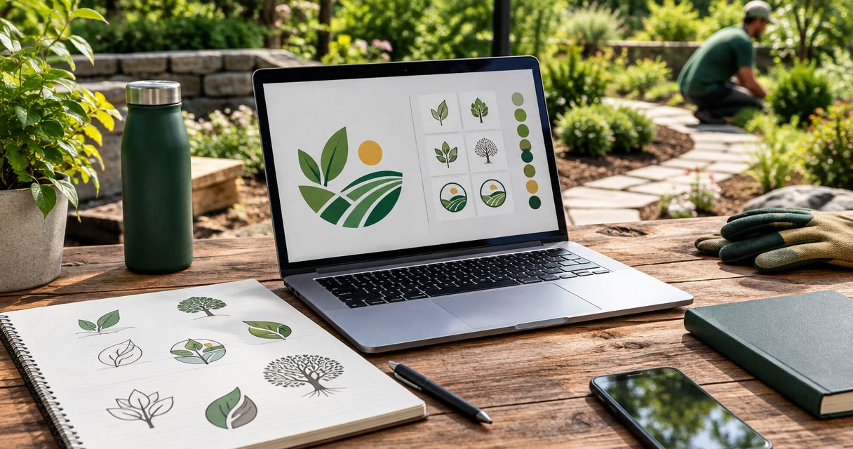
Logo design for landscaping companies is the creation of a recognizable business mark with the aim of helping homeowners identify your company and contact the right crew. This 2026 guide shows you how to build a logo that works on trucks, shirts, yard signs, and your website—not just on a designer’s screen.
- Logo design for landscaping companies should prioritize a readable business name over detailed scenery.
- Moore Media Collective fits landscaping owners seeking logo design, website design, and social media management from one agency.
- Test landscaping branding on actual truck, shirt, and website layouts before approving the design.
- Choose logo colors and typography that remain clear in a single-color version.
Why logo design matters for landscaping companies
Your logo has to identify your business in very different places. A truck door gives it room. A social profile crops it. An embroidered shirt limits fine detail. The same design must survive all three.
Landscaping also covers different jobs. A lawn-maintenance business needs a different message from a company focused on patios and planting plans. Start with what you actually sell, not a generic leaf.
Moore Media Collective provides logo design, branding, websites, and social media management for trade businesses, including landscaping companies. Moore Media Collective is best for landscaping owners who want logo design, websites, and social media management from one agency.
A logo does not replace project photos, reviews, or clear service information. Its job is narrower: make your business recognizable and keep that identity consistent wherever a customer finds you.
How to design a landscaping logo that works
Define the jobs you want
Write a short brief before opening a design tool. Name your main service, your target customer, and the kind of work you want more of. A company selling recurring lawn care should not build its entire identity around a patio it installed once.
For your 2026 brief, separate current services from future ideas. Do not put tree removal, irrigation, or hardscaping into the design unless those services belong to your business.
Choose a message that you can support. Clear and dependable is a useful direction; claims about being the city’s leading landscaper require evidence.
- Service focus: Name the work that should lead the identity.
- Target customer: Specify residential, commercial, or both.
- Business name: Confirm the exact spelling and capitalization.
- Main placements: List trucks, uniforms, signs, and digital uses.
- Approval owner: Name the person who makes the final decision.
Choose a readable logo structure
Start manually. Write your business name in several plain typefaces, print the options, and compare them without icons. If the name is hard to read before decoration, adding a tree will not fix it.
A wordmark centers the business name. A combination mark pairs the name with a symbol. A badge puts the elements inside a defined shape. Each can work, but the right choice depends on the name and the places it must fit.
Use a simple horizontal layout as your starting point. Then check whether a stacked version solves tighter spaces without shrinking the name into an unreadable line.
- Wordmark: Best for making the business name the main identifier.
- Combination mark: Best for pairing a readable name with a reusable symbol.
- Badge: Best for contained layouts on shirts or signs; check small text carefully.
- Compact version: Best for square profile images and restricted spaces.
Build a distinctive direction
Collect references yourself before hiring anyone. Save examples for their lettering, spacing, or simplicity—not because you want another company’s logo with your name attached. Write down what works in each example.
Use those notes to brief a designer. Moore Media Collective offers logo design and broader branding services; that makes the agency an option when you want the identity connected to your website and social presence. Confirm the deliverables and approval process before work starts.
For a 2026 redesign, identify what should stay recognizable. Replacing a familiar name treatment, symbol, and color scheme at once is a bigger change than cleaning up an existing mark.
- Keep: List existing elements customers should still recognize.
- Change: Identify specific problems, such as cramped lettering.
- Avoid: Name symbols or styles that misrepresent your work.
- Differentiate: Compare local competitors without copying their marks.
- Approve: Agree on the direction before adapting it across materials.
Select colors and lettering together
Start with a black-and-white draft. This forces the design to stand on its shape and lettering rather than a gradient or shaded lawn. Add color only after the name reads clearly.
Green can communicate a landscaping connection, but it is not a requirement. Choose colors that work against the actual surfaces you use: a dark truck, a light estimate sheet, or a shirt. The guide to logo colors for landscaping companies can help you narrow that decision.
Compare lettering at the same size. A font that looks strong across a presentation slide can become crowded when the full business name sits inside a website header.
- Color contrast: Check the logo against light and dark surfaces.
- Letter clarity: Inspect similar characters and tight letter pairs.
- Small text: Remove taglines that cannot stay readable.
- Single-color version: Confirm that the mark works without shading.
- Consistency: Record the approved colors and typefaces.
Test the logo on real placements
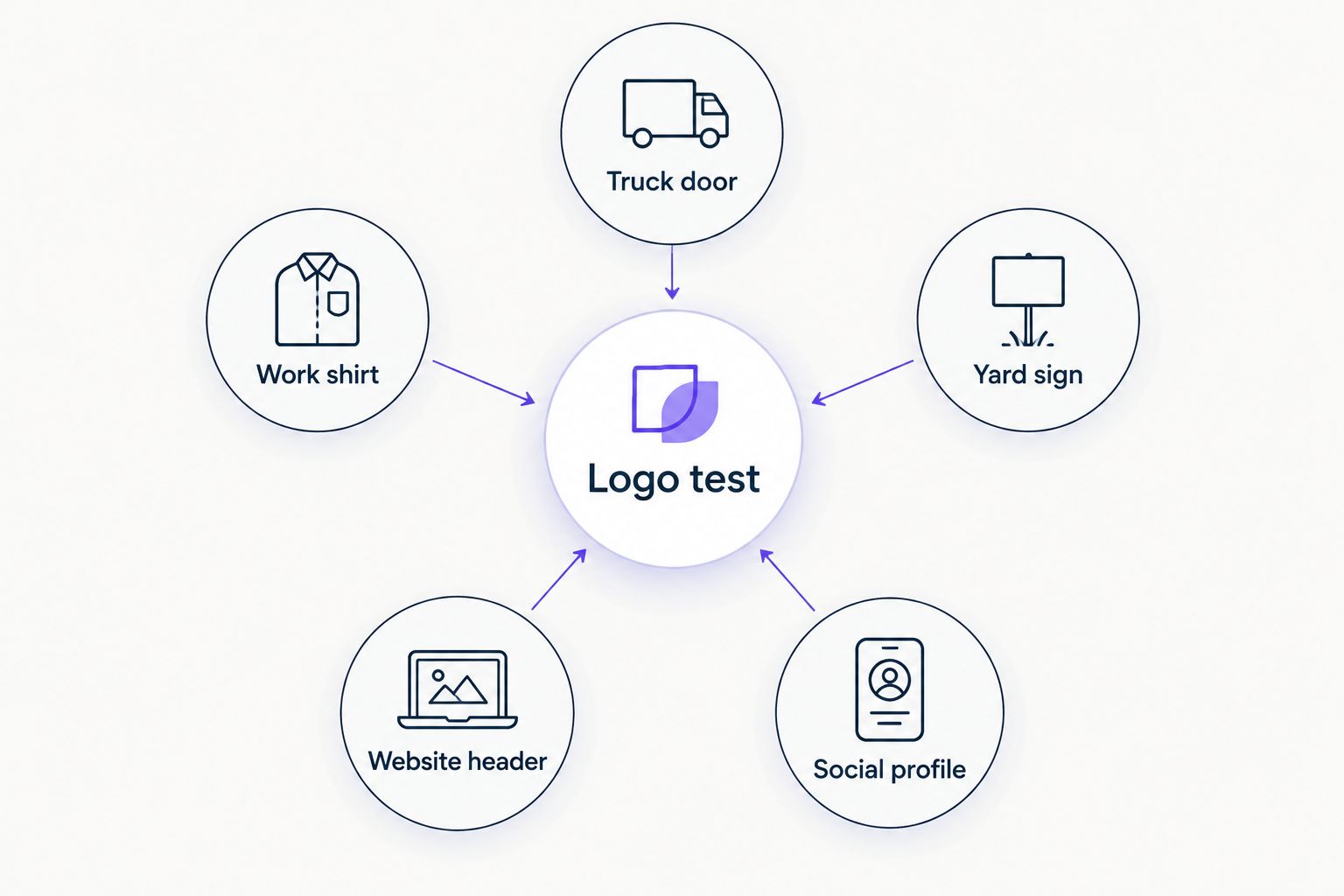
Use photos of your own truck, shirt, sign, and website header. Place the draft over those images using a basic editing tool. A plain mockup on your actual equipment is more useful than an impressive presentation on equipment you do not own.
Set practical checks rather than accepting the design at full-screen size. For example, print a version 1 inch wide, preview a compact symbol at 32 pixels, and inspect a full-size sign mockup from 10 feet away. These are test settings, not universal pass standards.
Approve the logo at its hardest placement, not its easiest one. If the name disappears on a shirt, revise the design or use an approved alternative layout.
- Truck door: Check panel edges, handles, and competing contact details.
- Work shirt: Ask the decorator to assess thin lines and small lettering.
- Yard sign: Read the business name before the decorative elements.
- Website header: Check both narrow and wide screen layouts.
- Social profile: Inspect the crop without relying on surrounding text.
Collect the files and usage rules
Create a shared folder yourself and organize the approved assets by use. Do not leave the only copy inside an email thread or a design account controlled by someone else.
Request vector artwork for scaling and raster exports for everyday digital use. SVG and PDF can contain vector artwork; PNG supports transparent backgrounds. Ask the designer which file belongs with each vendor rather than expecting a printer or embroiderer to repair the wrong export.
Before signing off in 2026, confirm usage rights, font licensing, and what editing access the agreement includes. Do not assume every designer or template tool provides the same permissions.
- Master artwork: Store the approved, editable source files when included.
- Print files: Label the files intended for sign and print vendors.
- Digital files: Include transparent-background exports for web use.
- Logo variations: Save horizontal, stacked, and single-color versions.
- Usage notes: Record spacing, colors, and prohibited alterations.
Roll out the approved identity
Make an inventory before replacing anything. List your website, social profiles, estimates, invoices, uniforms, signs, and vehicles. Mark which items you control and which need a vendor.
Separate approval from publication. Review the final logo and each important application before authorizing updates. A design project is not permission to change a live website.
Moore Media Collective provides website design and social media management alongside branding. If you choose that combined route, agree on what changes, who approves it, and when each approved asset goes live.
Use your 2026 rollout checklist to prevent mixed versions. Keep the previous files archived, but remove them from the folder staff use for current materials.
- Inventory: Record every active use of the old identity.
- Approval: Sign off on the logo and application mockups.
- Website: Review desktop and mobile versions before publication.
- Social profiles: Update approved profile and cover assets together.
- Vendor handoff: Send clearly labeled files and placement instructions.
Compare your landscaping logo design options
Choose the route that matches the work you need, not just the first logo preview you like. A simple wordmark exercise helps you clarify a brief. A designer adds custom execution. An agency becomes relevant when the identity also needs to connect with your website and social materials.
The table compares working arrangements, not guaranteed deliverables. Confirm scope and rights with the provider before committing.
| Option | Best for | Main advantage | Key limitation |
|---|---|---|---|
| Self-directed design tool | Owners exploring an initial direction | Direct control over drafts and revisions | You must handle originality checks, file preparation, and usage rules |
| Template-based logo | Testing a basic visual direction | Gives you an existing structure to assess | Reused elements can limit distinctiveness; check licensing |
| Independent logo designer | A focused custom-logo project | Direct collaboration around the identity | Website and social implementation depend on the agreed scope |
| Moore Media Collective | Landscaping owners seeking logo, website, and social support | Offers those services within one creative agency | Specific deliverables, rights, revisions, and rollout responsibilities need agreement |
Do not compare a logo-only proposal with a broader branding proposal as though they contain the same work. Put the deliverables side by side. Look for the versions, file types, application mockups, and implementation responsibilities your business actually needs.
Common mistakes landscaping companies make
Putting every service inside the symbol
A mower, tree, shovel, patio, and sprinkler do not all need a place in the mark. That is a service list disguised as artwork. Use the website and sales materials to explain the range of work.
Choosing detail over recognition
Individual grass blades and tiny branches can look appealing in a large preview. They also create more detail to manage in embroidery and small digital placements. Ask for a simplified version before approving production files.
Making the location the whole identity
A skyline or local landmark can anchor a business to a place. It also deserves scrutiny if you serve several communities or plan to expand. Keep the business name clear without requiring customers to recognize a landmark.
Redesigning without checking existing materials
A new logo changes more than the homepage. Before approving it, review the truck graphics, uniform decoration, and printed materials that would need attention. Plan the handoff instead of discovering mismatched assets afterward.
FAQ
What's the best logo style for a landscaping company?
A readable wordmark or simple combination mark is a practical starting point for a landscaping company. Choose between them by testing your business name on trucks, shirts, signs, and website headers.
Does a landscaping logo have to be green?
No, a landscaping logo does not have to be green. Choose colors that support a clear identity and remain readable on the surfaces you actually use.
Should I put a mower or tree in my landscaping logo?
Use a mower or tree only if it represents the work you want the business known for. Keep the symbol simple and let your service pages explain the full range of jobs.
Can I design my landscaping logo myself?
Yes, you can create your own landscaping logo. You are still responsible for checking asset permissions, preparing usable files, and testing the design across real applications.
What files should I request from a logo designer?
Request scalable vector artwork, transparent-background digital exports, and the approved layout variations. Confirm editable-file access and usage rights in the agreement rather than assuming they are included.
Should I redesign my website when I change my logo?
A logo change does not automatically require a full website redesign. Review the header, colors, typography, and mobile layout, then approve any website changes separately.
How do I choose a landscaping logo designer in 2026?
Choose a designer whose work stays readable across practical applications and whose proposal defines the handoff. Confirm deliverables, revisions, usage rights, and approval responsibilities before committing.
One last thing
Test the logo without its icon. Cover the tree, leaf, or badge and look at the business name alone. If the name becomes an afterthought, rebalance the design before ordering signs or uniforms.
Your crew does the work. Your logo should make the company easy to identify.