
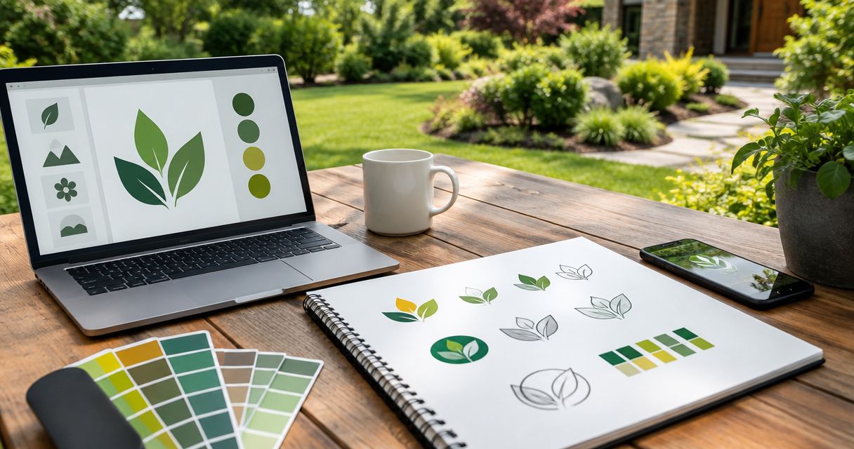
Best overall: forest green and white. Best for design-led landscaping: charcoal and cream. Best for single-color use: charcoal. These are the best logo colors for landscaping companies to shortlist in 2026, with options for lawn care, hardscaping, planting, and commercial maintenance.
- Forest green and white tops the best logo colors for landscaping companies shortlist for general lawn and landscape services.
- Charcoal and cream suits design-led landscaping; navy and white suits commercial maintenance branding.
- Mmcollective provides logo design and branding for landscaping companies that need a consistent business identity.
- Test every palette on your truck, website, workwear, and a single-color version before approving it.
Why this matters
Your logo needs to work where customers actually see it. That means a truck door, a yard sign, a website header, and a small social profile image—not just a large design presentation.
Choose colors around your work and the surfaces you use. A landscaping company focused on patios needs a different visual direction from a mowing business built around neighborhood routes. Neither needs a complicated palette.
Mmcollective provides landscaping logo design alongside branding, websites, and social media management. Start with Mmcollective if you want those pieces planned together rather than treated as unrelated jobs.
Color alone does not book a landscaping job. Your service description, project photos, contact details, and next step still need to be clear. The logo should support that information, not compete with it.
What makes the best landscaping logo colors?
Use these criteria to judge your 2026 shortlist before choosing a favorite:
- Background contrast: Test the logo against the actual truck paint, shirt fabric, sign panel, and website background.
- Service fit: Choose a direction that matches the work you want to sell, whether that is mowing, planting, or hardscaping.
- Readable lettering: Keep the business name clear without relying on outlines, shadows, or tiny accent details.
- Single-color strength: Make sure the mark still works when every element uses the same ink.
- Consistent reproduction: Approve print and screen specifications rather than asking each supplier to match a screenshot.
- Local distinction: Compare the proposed palette with nearby landscapers before committing to it.
Do not treat color associations as promises. Green does not prove sustainable practices. Black does not prove expensive workmanship. Your claims need evidence separate from your design choices.
Landscaping logo colors at a glance
These are design recommendations for 2026, not a ranking based on measured lead generation. Each palette has a different job.
| Rank | Palette | Best for | Standout feature | Key limitation |
|---|---|---|---|---|
| 1 | Forest green and white | General lawn and landscape services | Direct plant-related color reference | Can resemble other green landscaping identities |
| 2 | Charcoal and cream | Design-led landscaping | Restrained background for project photography | Needs wording to establish the trade |
| 3 | Navy and white | Commercial grounds maintenance | Simple pairing for documents and uniforms | Has no direct plant reference |
| 4 | Olive and sand | Planting-focused landscape work | Muted, earth-toned direction | Similar lightness can weaken contrast |
| 5 | Deep brown and white | Hardscaping and outdoor construction | Earth-toned alternative to green | Can resemble other construction trades |
| 6 | Charcoal alone | Single-color production | Does not depend on a second ink | Needs a reversed version on dark surfaces |
1. Forest green and white: best for general landscaping
Forest green and white is the default recommendation for a business handling lawn care and general landscaping. Green provides a direct visual reference to plants. White gives you a clear background or reversed lettering option.
Use a dark green for the main business name. Keep leaf details optional; a readable name matters more than adding another landscaping symbol.
Forest green and white pros:
- References vegetation without needing an illustrated scene.
- Supports a straightforward dark-on-light logo.
- Gives you a useful white version for dark backgrounds.
Forest green and white cons:
- Offers little distinction if nearby companies use similar green marks.
- Loses clarity when green lettering sits over lawn photography.
Best for: Owner-operated lawn and landscape companies with a broad service mix.
For your 2026 refresh, compare the proposed green against nearby competitors and your truck paint. Do not approve it on a white screen alone.
Verdict: Buy this direction as the default, then check local similarity.
2. Charcoal and cream: best for design-led landscaping
Charcoal and cream suits a company that wants completed gardens, patios, and outdoor spaces to carry the visual story. The palette keeps the logo restrained rather than adding another bright element beside project photos.
Use charcoal for the business name and cream as a supporting surface. Keep a plain white alternative for documents and applications where cream is not practical.
Charcoal and cream pros:
- Leaves room for colorful planting and project photography.
- Works without a literal leaf or grass symbol.
- Supports a simple, type-led identity.
Charcoal and cream cons:
- Does not identify landscaping without supporting words or imagery.
- Requires checking cream backgrounds against the chosen lettering color.
Best for: Landscape design and installation businesses presenting finished outdoor spaces.
Pair the logo with a clear service description. Customers should not have to guess whether you design gardens, build patios, or sell furniture.
Verdict: Buy for design-led work; skip if you need color alone to signal lawn care.
3. Navy and white: best for commercial grounds maintenance
Navy and white is a practical direction for commercial grounds maintenance branding. It gives you a simple system for proposals, uniforms, vehicle lettering, and website navigation.
The trade needs to come through in the name, service line, and photographs. Navy is not a landscaping-specific cue, so do not expect the palette to explain your business by itself.
Navy and white pros:
- Supports clear dark lettering on white documents.
- Provides an uncomplicated reversed white logo.
- Leaves green available for project photography rather than the main mark.
Navy and white cons:
- Can resemble unrelated professional-service identities.
- Needs separation from dark blue vehicle paint or clothing.
Best for: Landscaping companies whose main offer is commercial property maintenance.
Build the supporting message around the work you actually provide. Avoid adding claims about coverage, response times, or contract capabilities just to make the identity sound bigger.
Verdict: Buy for commercial maintenance when the service wording is explicit.
4. Olive and sand: best for planting-focused landscaping
Olive and sand is a direction to consider when planting, garden beds, and natural materials define your work. It offers an earth-toned alternative to brighter lawn-care greens.
Make olive the darker anchor. Sand works better as a supporting background than as small lettering on white, where the difference between the colors can be too slight.
Olive and sand pros:
- Connects the palette to foliage and soil-related tones.
- Gives planting photography room to supply brighter color.
- Creates a distinct alternative to a bright green starting point.
Olive and sand cons:
- Similar lightness between shades can weaken readability.
- Muted lettering needs careful testing against dusty vehicles and workwear.
Best for: Planting-focused businesses whose project portfolio supports the direction.
Do not turn the palette into an environmental claim. Use specific, accurate language about your planting services instead of implying certifications or practices through color.
Verdict: Buy for planting-led work, with a dark enough primary shade.
5. Deep brown and white: best for hardscaping
Deep brown and white suits landscaping businesses centered on patios, retaining walls, and outdoor construction. It takes the identity away from a lawn-only visual direction.
Use a deep brown rather than light tan for the main lettering. Let actual project photos show the stone, timber, and other materials you work with.
Deep brown and white pros:
- Provides an earth-toned alternative to green.
- Fits a material-focused presentation of outdoor projects.
- Supports a straightforward white reversed mark.
Deep brown and white cons:
- Can resemble building or carpentry identities.
- Needs testing against brown workwear and vehicle finishes.
Best for: Landscapers whose main work is hardscape installation rather than routine mowing.
Keep the symbol simple. A detailed wall, patio, tree, and shovel inside the same mark creates more elements to resolve at small sizes.
Verdict: Buy for hardscaping when the name or service line explains the work.
6. Charcoal alone: best for single-color production
A charcoal logo is the simplest direction when you want the identity to work without a secondary color. The lettering and shape must do the work.
Create both a dark version and a white reversed version. A single-color identity still needs to adapt to different backgrounds; it does not mean using dark ink everywhere.
Charcoal alone pros:
- Does not rely on a second color to separate elements.
- Makes a useful starting point for reviewing the logo’s shape.
- Leaves website and project photography free to carry color.
Charcoal alone cons:
- Offers no direct plant-related color reference.
- Depends heavily on distinctive lettering or a clear symbol.
Best for: Owners who prioritize a simple mark across varied applications.
Use this as a test even if you eventually choose another palette. If essential details disappear without color, revise the mark before adding decoration.
Verdict: Buy for simplicity; skip if the design depends on color-coded details.
How we ranked these palettes
Forest green and white takes the default slot because its plant reference fits general landscaping. The remaining recommendations separate by service focus or production need, not by an unsupported claim that one color generates more calls.
The ranking follows the criteria above: background contrast, service fit, readable lettering, single-color strength, consistent reproduction, and local distinction. Your actual truck, workwear, and service mix decide the final choice.
Test the palette before you approve it
For a 2026 logo decision, ask for application mockups rather than another page of isolated color swatches. Use the same business name and layout across the options so you are comparing color, not different designs.
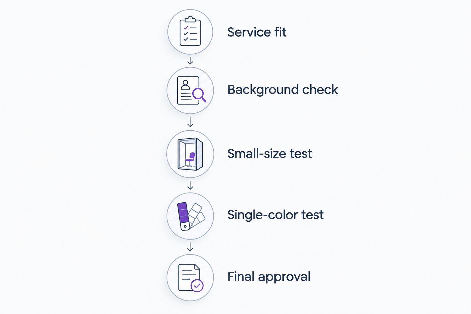
Service fit
Write down the work you want the logo to represent. Lead with the service you want customers to ask about, not a service you rarely provide.
Background check
Place the proposed logo on a photo of your actual truck and work shirt. Include the website header and a yard-sign layout. Ask for a reversed version wherever the background is dark.
Small-size test
As practical review targets, inspect the symbol at 32 pixels wide and the full logo at 1 inch wide. These are chosen test sizes, not universal production standards. Remove details that stop being useful at the sizes you need.
Single-color test
Review the logo in 1 ink color before approving the full palette. For the main identity, start with 2 colors and add another only when it has a clear job.
Final approval
Approve the logo files, color specifications, and application examples together. Review proposed website changes separately before anything goes live.
A small profile image deserves its own check. The guide to Google Business Profile photos for landscapers covers another part of your business’s local presentation.
Which landscaping logo colors should you choose?
Choose forest green and white unless your service focus gives you a clear reason not to. Choose charcoal and cream for design-led work, navy and white for commercial maintenance, or deep brown and white for hardscaping.
For your 2026 branding project, give Mmcollective a clear landscaping logo design brief: your main services, actual applications, and nearby competitors to distinguish the business from. Ask to review the proposed direction before approving production files or website changes.
Plan your landscaping brand
Discuss logo design, branding, and a website that presents your landscaping services clearly.
FAQ
What are the best logo colors for landscaping companies?
Forest green and white is the default recommendation for general landscaping. Charcoal and cream suits design-led work, while navy and white is an alternative for commercial maintenance branding.
Does my landscaping logo have to be green?
No. Your landscaping logo can use navy, charcoal, brown, or another palette that suits your work. Make the service clear through your business name, supporting wording, and project photos.
What logo colors should a lawn care business choose?
Start with forest green and white for a lawn care business. Compare the proposed shades with nearby competitors and test the logo against your actual vehicle and clothing backgrounds.
Are black and gold good landscaping logo colors?
Treat black and gold as an optional design direction, not proof of quality. Review the lettering on real applications and check that any light gold details remain readable against their backgrounds.
How many colors should my landscaping logo use?
Start with 2 colors for the main landscaping logo and require a working single-color version. Add another color only when it serves a clear purpose in the design.
Should my landscaping website use the same colors as my logo?
Use the logo palette as a starting point, not a rule for every website element. Body text, backgrounds, and contact buttons still need clear contrast and a consistent purpose.
Can Mmcollective help with landscaping logo design?
Mmcollective provides logo design, branding, websites, and social media management for landscaping companies. Discuss the service focus and applications you need, then review the proposed work before approval.
One last thing
Approve the plain version first. Before judging a logo on a polished truck mockup, look at it as a flat mark on a plain background. That separates the actual design from the presentation around it.
If the business name is hard to read there, a better color will not fix the lettering.