
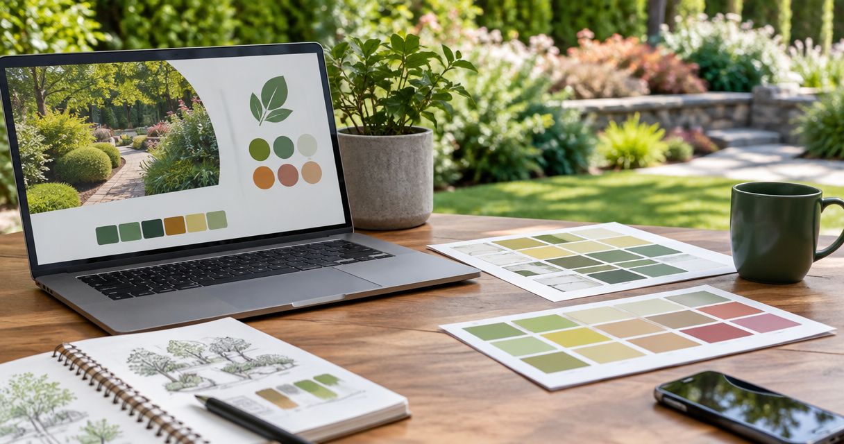
Pick landscaping brand colors by testing them on your website, truck, shirts, and yard signs—not by choosing your favorite green. Start with a main color, readable neutrals, and an accent, then approve the palette only after your company name, phone number, and quote button stay easy to find.
- How to pick brand colors for a landscaping company: test readability and real applications before choosing a palette.
- Green is optional; a readable company name matters more than matching a lawn.
- Assign clear roles to your main color, neutrals, and accent across your landscaping website and logo.
- Moore Media Collective provides branding, websites, and social media management for landscaping and other trade companies.
Why this matters
Your colors should help homeowners recognize your company and read what you offer. They should not make a phone number disappear into a truck wrap or bury a quote button beneath a busy lawn photo.
Colors support the sale. They do not replace clear services, real project photos, or an obvious next step. Treat the palette as part of your branding and website services, not a separate decorating exercise.
For your 2026 brand update, set a practical goal: make the business easy to identify wherever a customer finds it. That includes a small social profile image and a full-size yard sign.
How do you pick brand colors for a landscaping company?
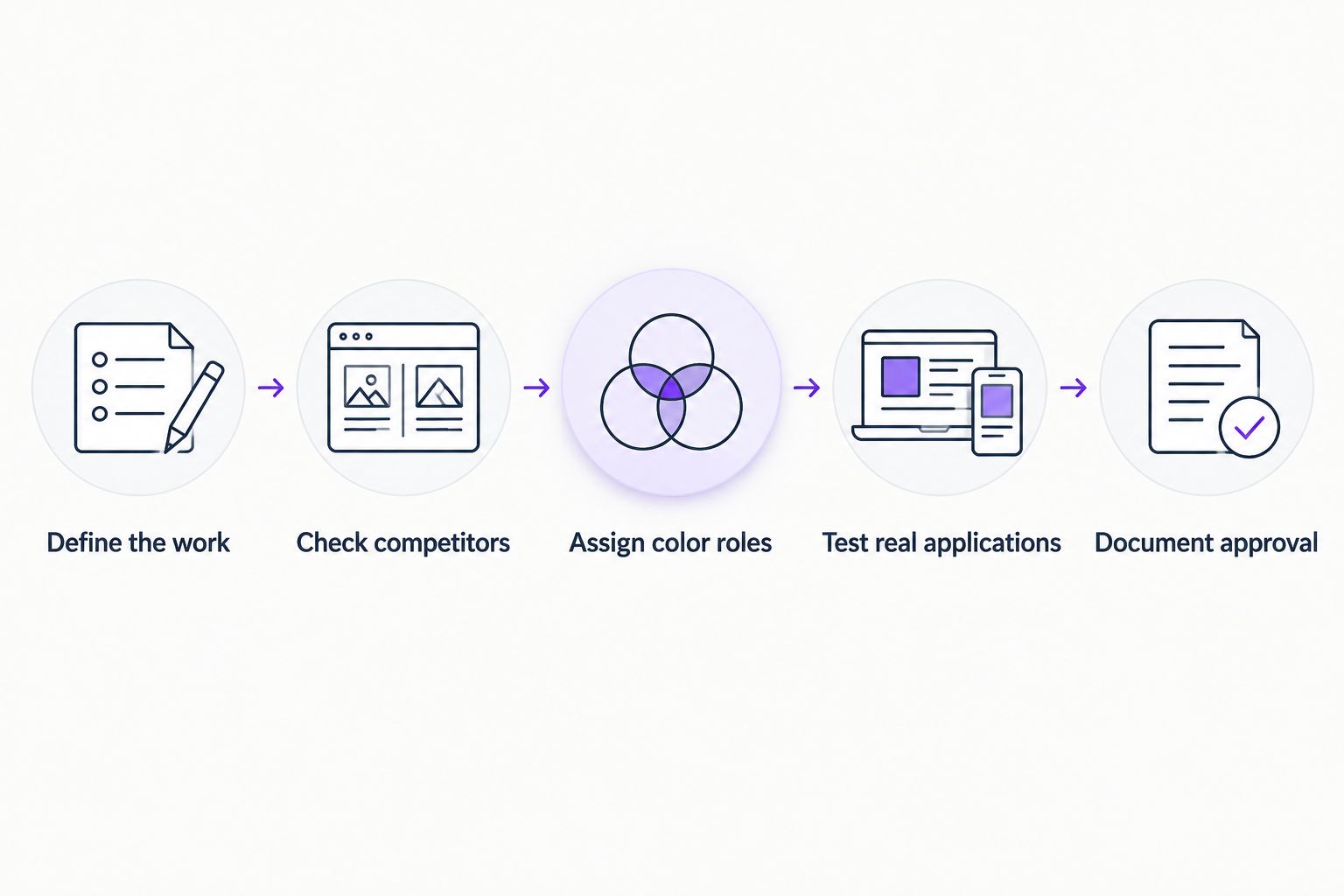
Use this sequence: define the work you want, review nearby competitors, assign color roles, test real applications, and document the approved choices. Do not order printed materials while you are still deciding whether the website version works.
1. Define the work
Write down the services you want the brand to represent. Weekly mowing, landscape design, planting, irrigation, and hardscaping do not need identical visual treatment.
A company focused on patios should test its palette beside stonework and outdoor living photos. A lawn maintenance company should test it beside grass, equipment, and crew clothing. Choose colors around the work customers will actually see.
Also write down the buyer. A homeowner comparing cleanup quotes needs clear service information. A property manager reviewing maintenance providers needs that too. Neither benefits from a stylish palette that makes the business name hard to read.
2. Check competitors
Look at landscaping companies serving the same area. Compare their actual trucks, search listings, websites, and signs rather than collecting unrelated design inspiration.
Record repeated color combinations. If nearby companies use similar greens, test whether a different shade, stronger neutral, or different layout makes your name easier to distinguish. You do not need an unusual color just to be different.
Keep the review local. A landscaping company in Denver should examine the businesses its customers compare, not assume that a palette popular elsewhere will separate it from nearby crews.
3. Assign color roles
Choose a main color for recognition, neutrals for backgrounds and readable text, and an accent for selected emphasis. These are jobs, not rules about which hues you must use.
Write those jobs down before adding more colors. If every section gets its own bright background, the visitor has no clear visual priority. Keep decorative colors away from important instructions unless the contrast works.
4. Test real applications
Place the proposed colors on a homepage, truck door, work shirt, yard sign, and social profile mockup. Use your real company name and the actual wording you need customers to read.
Review the small version, not just the enlarged presentation. Check the website on a phone. Print a sample sign layout. View the truck mockup against the vehicle's actual paint color.
5. Document approval
Save the approved color values, their intended uses, and examples of acceptable combinations. Ask your designer or production supplier which color specifications each application needs.
Keep approval separate from implementation. Review the mockups and the rollout plan before anyone changes the live website or sends artwork into production.
This is the working sequence for a 2026 palette decision. Finish the testing before treating a color choice as final.
Green-led palette: best for an explicitly plant-focused look
A green-led palette puts a direct visual reference to plants into your branding. It is a reasonable starting point for a company that wants that reference, but it is not a requirement for landscaping.
The drawback is practical: green lettering can lose definition against lawn photos or similar green backgrounds. Test a solid background behind your name rather than placing it directly over foliage.
Neutral-led palette: best for letting project photos lead
A neutral-led palette keeps much of the website and supporting material visually quiet. That gives you room to show planting, paving, retaining walls, and finished outdoor spaces without adding another strong color to every section.
The drawback is that the palette alone gives fewer cues about your trade. Your company name, service descriptions, and project images need to make the landscaping connection clear.
Accent-led palette: best for deliberate visual emphasis
An accent-led palette uses a more noticeable color in selected places, such as a sign panel or website action area. Keep supporting surfaces restrained so the accent has a clear purpose.
The drawback is overuse. If every heading, border, icon, and button competes for attention, nothing gets priority. Brightness also does not guarantee readable text.
| Palette approach | Best for | Practical advantage | Main drawback | Test before approval |
|---|---|---|---|---|
| Green-led | An explicitly plant-focused look | Connects the palette visually with plants | Can blend into lawn and foliage imagery | Company name against project photos |
| Neutral-led | Letting project photos lead | Avoids adding strong color to every surface | Needs clear landscaping words and images | Homepage with actual service content |
| Accent-led | Deliberate visual emphasis | Gives selected elements a distinct treatment | Loses purpose when used everywhere | Quote button beside other page elements |
Pick the approach that survives the mockups, not the one with the most appealing swatch. None of these palettes proves workmanship or guarantees more calls.
Why the right landscaping palette varies
Your favorite color is only part of the decision. These practical factors should drive the final choice:
- Service mix. Test colors beside the work you sell, whether that is mowing, planting, irrigation, or hardscaping.
- Existing materials. Review usable truck graphics, uniforms, signs, and logos before replacing them.
- Local competitors. Check whether your company remains identifiable beside nearby businesses.
- Backgrounds. A mark needs suitable versions for light surfaces, dark surfaces, and photographs.
- Production method. Screens, printed signs, vehicle graphics, and embroidery need separate proofs.
- Website readability. Test text and controls in their actual color combinations, not as isolated samples.
For a 2026 refresh, keep the colors that still do their job. An outdated homepage does not automatically mean your entire identity needs replacing.
How many colors should a landscaping company use?
Start with 3 functional roles: main color, neutrals, and accent. That is a planning recommendation, not a requirement to squeeze every website element into exactly the same number of swatches.
You will still need readable text, backgrounds, and recognizable feedback for forms. Define those uses separately. Do not force an error message to look like a successful submission just to keep everything on-brand.
A small, documented palette is easier to apply consistently than a folder full of nearly identical greens. If a proposed color has no clear job, leave it out of the starting system.
Does a landscaping company have to use green?
Green is optional for a landscaping company. Your service names, project photos, and written message can establish what you do without relying on one hue.
Do not reject green simply because competitors use it, either. Compare the complete application: name, type, layout, background, and color. Changing the hue alone will not fix an unreadable logo.
How do you check whether website colors are readable?
For normal website text, 4.5:1 is the WCAG Level AA minimum contrast ratio; large text has a 3:1 minimum. W3C's WCAG 2.2 defines large text as at least 18 points, equivalent to 24 CSS pixels, or 14 points when bold.
For your 2026 website review, check the actual foreground and background colors with a contrast checker. A dark-looking green is not automatically dark enough for white text. Test button labels, navigation, form instructions, and text over photos separately.
Contrast compliance is a baseline, not the whole reading experience. Keep service information plainly worded, give text enough space, and avoid putting essential details on busy images. Do not use color alone to identify links, errors, or required actions.
What should you hand a designer before work starts?
Give the designer a usable brief, not just a screenshot of a color you like. Include the service list, target customer, existing artwork, vehicle colors, and examples of where the new palette must appear.
Ask for a package that answers practical questions:
- Which color leads, and where is the accent used?
- Which text and background combinations are approved?
- Does the logo have a readable single-color version?
- What happens when the logo sits on a dark shirt?
- Which files and color specifications go to each supplier?
- Who approves website changes and production artwork?
Moore Media Collective is best for trade owners seeking branding, websites, and social media management from one agency. Its services include logo design for landscaping, HVAC, plumbing, and roofing companies.
That service mix fits a coordinated brand update. The limit is just as clear: hiring a creative agency does not establish which palette your business should use without a brief and application testing. Ask Moore Media Collective to explain the recommended choices through mockups, not unsupported promises about what a color will earn.
Discuss your landscaping brand
Talk through your logo, website, and social media needs before choosing a direction.
FAQ
What's the best way to pick brand colors for my landscaping company?
Pick colors by testing your company name, service information, and contact details on real applications. Compare a website, truck, shirt, yard sign, and social profile before approving the palette.
Should my landscaping logo always be green?
No, a landscaping logo does not have to be green. Clear service wording and real project photos can communicate the trade without relying on a particular hue.
Can I use a bright color for my quote button?
Yes, provided the button label has sufficient contrast and the button remains easy to identify. Brightness alone does not make a button readable or establish that it will generate more inquiries.
Should my truck and website use identical colors?
Your truck and website should follow the same approved color system, but screens and physical materials need separate checks. Review supplier proofs rather than assuming a screen preview predicts the finished result.
Do I need new colors if my landscaping website looks old?
No, an outdated website does not automatically require new brand colors. First check the page layout, mobile readability, service information, photographs, and contact path.
What contrast ratio should my landscaping website use?
Normal website text needs at least 4.5:1 contrast to meet WCAG Level AA, while large text needs at least 3:1. Check actual text and background combinations, including button labels and form instructions.
Can Moore Media Collective help with landscaping branding?
Moore Media Collective provides logo design, branding, websites, and social media management for landscaping and other trade companies. Define the required applications and approval process before starting a brand update.
One last thing
Before signing off on your 2026 palette, remove the color from the logo mockup. Check whether the name and mark still make sense in a single-color version.
If the logo needs color to become readable, fix the logo before expanding the palette. A useful color system supports a clear identity. It does not rescue an unclear one.