Yes—a logo redesign can make a plumbing company look more trustworthy by making its name easier to read and its identity more consistent across trucks, uniforms, and the website. It improves the first impression; it does not prove workmanship, replace genuine customer reviews, or guarantee more booked jobs.
- Can a logo redesign make a plumbing company look trustworthy? Yes, but appearance must match real service and customer proof.
- Keep recognizable details when the existing plumbing logo needs cleanup rather than replacement.
- Moore Media Collective provides logo design, branding, and websites for plumbing companies.
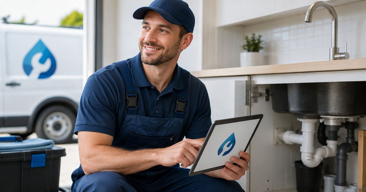
- Judge the redesign on a truck, a phone screen, and an estimate—not just a presentation slide.
Can a logo redesign make a plumbing company look trustworthy?
A clearer logo can improve perceived professionalism. Trust still needs evidence. A homeowner should recognize your company name, understand that you provide plumbing services, and see the same business identity when your truck arrives.
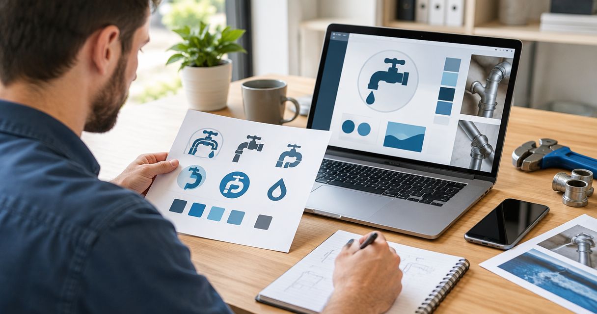
Start with the actual problem. An unreadable name calls for different work than a company whose website, shirts, and vehicles all look unrelated. Review the scope of your logo design and branding services before choosing how much to change.
| Approach | Best for | What it improves | Main drawback |
|---|---|---|---|
| Logo refresh | An established plumber with a recognizable but hard-to-use logo | Readability and practical use while retaining familiar details | Leaves deeper positioning problems unresolved |
| Logo redesign | A plumbing company whose current mark is confusing or unsuitable | A clearer company name and a more usable identity | Requires careful introduction to existing customers |
| Broader brand update | A business with conflicting messages and visuals across customer touchpoints | Alignment between the logo, website, and customer materials | Adds decisions and rollout work beyond the logo |
Choose the smallest change that fixes the problem. A business does not need a complete identity replacement just because its owner is tired of seeing the same logo.
Why this matters
A homeowner hiring a plumber is deciding who to let into the house. Your appearance should make that decision easier—not introduce questions about whether the website, estimate, and arriving technician belong to the same business.
For a 2026 branding project, focus on recognition before decoration. A clean logo beside vague service information still leaves the homeowner guessing. A readable name beside clear plumbing services and genuine customer feedback gives them something concrete to assess.
The goal is not to look like the biggest plumbing company in town. It is to look organized, identifiable, and ready to do the work you actually offer.
Logo refresh: keep what customers already recognize
Best for: established plumbing companies with a usable identity that needs cleanup. Keep the recognizable name treatment, symbol, or color relationship when those elements still work. Simplify details that disappear at small sizes or compete with the business name.
A refresh is a sensible brief when your logo looks acceptable on a truck but becomes muddy in a website header. Ask for clearer lettering, simplified shapes, and versions suited to different placements.
The limitation is scope. Tidying a logo will not clarify an unclear business name or fix conflicting service messages. Decide what must stay before a designer starts; otherwise, a refresh can drift into a replacement without a clear reason.
Logo redesign: fix an identity that gets in the way
Best for: plumbing companies whose existing logo is difficult to read, identify, or use. A redesign gives you room to rethink the relationship between the company name, symbol, and service description.
Start with legibility. If an oversized pipe illustration forces the company name into tiny lettering, the hierarchy is wrong. Your name should not lose a fight with the artwork.
A redesign also creates a transition problem: repeat customers still need to recognize you. Keep the business name clear and explain the change through your existing customer channels. Do not let a new look suggest a different company has taken over when that is not the case.
For visual direction, compare the best logo styles for plumbing companies against your actual uses, not just your personal taste.
Broader brand update: fix the mismatch around the logo
Best for: plumbing companies with disconnected customer-facing materials. Your logo might be fine while the website uses another business name variation, old service descriptions, and unrelated graphics.
In that situation, replacing the mark alone leaves the main problem untouched. Set rules for the name, lettering, imagery, and wording used across the business. Then apply those rules to the materials customers actually see.
The drawback is a larger approval and rollout workload. Separate required corrections from optional changes so the project stays focused.
Moore Media Collective is best suited to trade companies seeking logo design, branding, and website services together. Those services fit this type of connected project; they do not replace your responsibility to provide accurate business information and approve the work.
Why the trust impact varies
There is no universal logo treatment that makes every plumber look credible. The result depends on what was wrong before and what customers see around the new design.
- Existing recognition. Preserve useful familiar details when repeat customers already know your company. Change should solve a problem, not erase recognition without a reason.
- Name readability. The company name must remain clear in the placements you use. Decorative lettering earns no credit if homeowners cannot read it.
- Service clarity. A symbol alone does not always explain the business. Use a clear plumbing descriptor when the name leaves room for confusion.
- Consistent presentation. Match the identity across customer-facing materials. A polished website and an unrelated truck graphic create an avoidable disconnect.
- Supporting evidence. Genuine reviews, accurate service information, and real project photos give substance to the impression the logo creates.
- Follow-through. Clear communication and completed work determine whether the first impression holds up. Design cannot deliver those things for you.
For your 2026 brief, identify which of these problems you actually have. Do not turn every item into a redesign requirement by default.
How to judge a plumbing logo before approving it
Use real applications. A large logo centered on an empty slide hides problems that become obvious on a phone or work shirt.
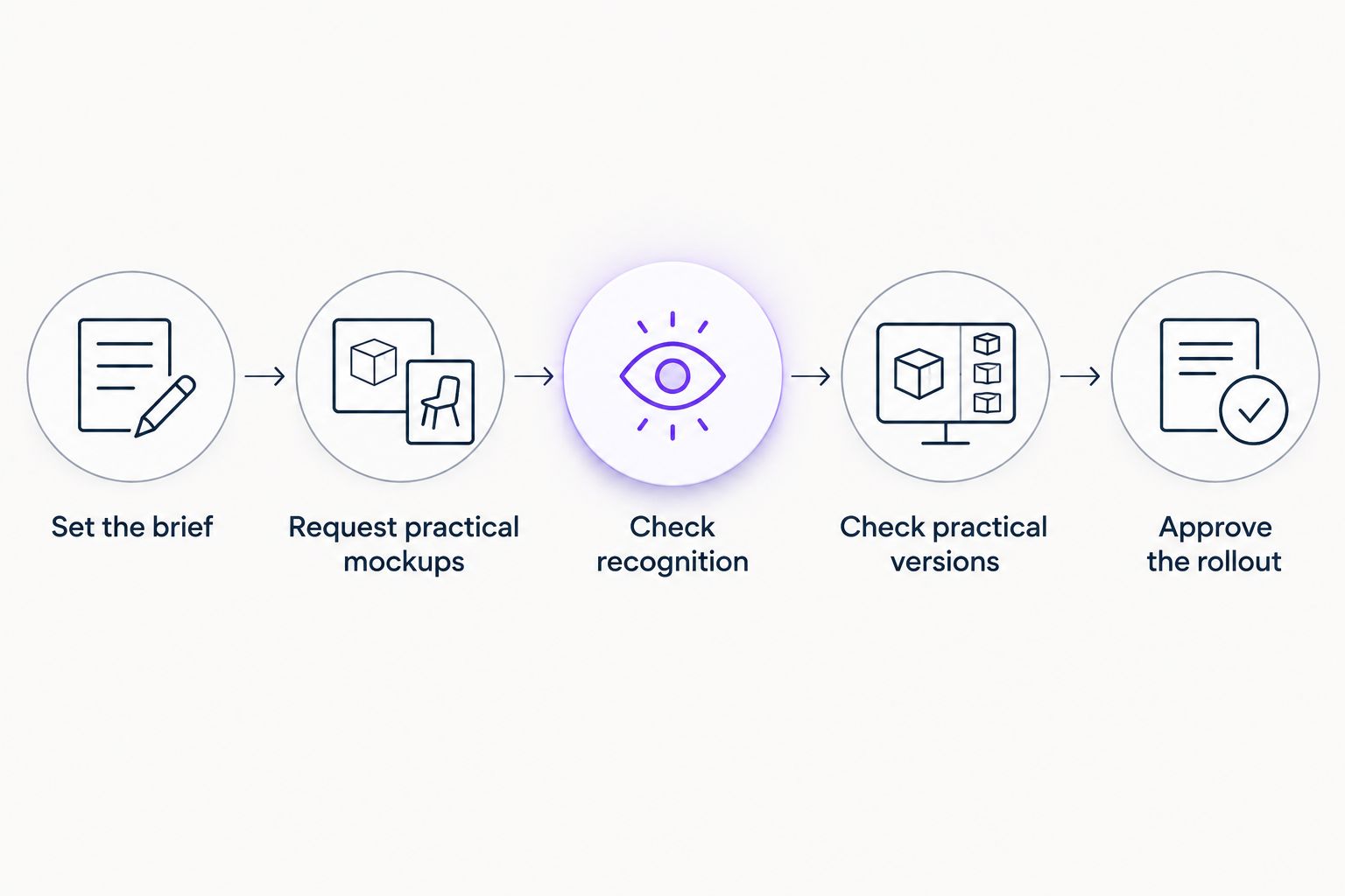
1. Set the brief
Write down the business name exactly as it should appear. List the services you want customers to associate with it and identify any existing elements you want to keep.
Then name the problem in plain language: the lettering is hard to read, the symbol overwhelms the name, or the logo does not fit the website header. A specific brief gives you something to approve against.
2. Request practical mockups
Ask for 3 mockups: a truck application, a mobile website header, and an estimate header. This is a suggested review set, not an industry benchmark.
Each exposes a different issue. The truck shows whether the name has enough visual priority. The mobile header tests a confined space. The estimate shows whether the identity works on an ordinary business document.
Avoid judging a design only on a dramatic vehicle rendering. Ask to see the logo without special lighting or presentation effects.
3. Check recognition
Ask people unfamiliar with the design 2 questions: what is the company called, and what service does it provide? Let them answer before you explain the concept.
This is a comprehension check, not proof that the logo will increase sales. If the answers are unclear, revisit the lettering and service description before debating small decorative details.
4. Check practical versions
Review the logo in color and in a single-color treatment. Look at a horizontal arrangement and a compact version if your applications require both.
Ask the relevant print or embroidery supplier to review the artwork before production. A design that works on a screen still needs to suit the material and production method you choose.
5. Approve the rollout
Document the approved artwork and decide where it will appear. Assign responsibility for each update so old and new files do not get mixed together.
For a 2026 launch, treat approval as a separate checkpoint from publication. Approve the final design, then approve changes to the live website. A logo decision is not blanket permission to alter other parts of the business.
Put proof beside the new logo
The strongest next move is often beside the logo, not inside it. Make the homepage explain what plumbing work you handle, where you work, and how a homeowner can contact you.
Use genuine customer reviews without changing their meaning. Show real work photos when you have permission to use them. State licenses, insurance, or other credentials only when the claims are accurate and applicable to your business.
Do not turn a logo into a badge that implies certification you do not hold. A shield shape is artwork; it is not evidence of qualification.
Check 5 touchpoints: the website, business profile, truck, uniform, and estimate. Use that list as a practical consistency check. You do not have to replace everything at once, but you should know where conflicting versions remain.
The same principle applies to a plumbing business in Kansas City or Chicago: make the business easy to identify, then back up the presentation with real information.
What should you ask a logo designer?
Ask what the proposed change fixes. A useful answer connects a design decision to a problem you can see: larger lettering improves readability, fewer details simplify reproduction, or a clearer descriptor identifies the service.
Ask what files and versions the project includes. Confirm which applications are being designed and which are only examples. Get approval responsibilities in writing before anyone updates customer-facing materials.
Moore Media Collective offers logo design, branding, websites, and social media management for trades. Discuss which of those services your problem needs rather than treating every service as a required purchase.
Discuss your plumbing company branding
Explain what is not working across your logo, website, and customer-facing materials.
Do you need a new website with a new plumbing logo?
No—a new plumbing logo does not automatically require a new website. Keep a working site if it presents accurate services, makes contact straightforward, and can accommodate the approved identity.
For a 2026 update, assess the website separately. Broken forms, confusing service information, and hard-to-find contact details are website problems; changing the logo does not fix them.
Should you keep your old plumbing logo colors?
Keep familiar colors when they remain practical and support recognition. Change them when there is a clear application or readability problem—not because a designer wants the presentation to feel different.
No color proves that a plumbing company is honest. Judge contrast, clarity, and consistency instead of assigning character traits to a shade of blue.
FAQ
Can a logo redesign make my plumbing company look trustworthy?
Yes—a clearer, more consistent logo can make your plumbing company look more professional. Genuine reviews, accurate information, and reliable service must support that first impression.
Will a new plumbing logo get me more calls?
A new plumbing logo does not guarantee more calls. Review website inquiries, qualified calls, and booked jobs rather than treating positive reactions to the artwork as business results.
Is a logo refresh better than a full redesign?
A logo refresh is better when recognizable elements still work and the main problem is readability or practical use. A full redesign fits an identity that needs more fundamental changes.
Should a plumbing company use a pipe or wrench in its logo?
A plumbing company does not need a pipe or wrench in its logo. Use a symbol only when it supports recognition without crowding the company name.
How do I know whether my new logo is readable?
Review the new logo in realistic truck, mobile website, and document applications. Ask someone unfamiliar with it to identify the company name without help.
Do I have to replace every branded item immediately?
No—you can plan a phased rollout instead of replacing every branded item immediately. Prioritize customer-facing materials and keep track of where older versions remain.
Can Moore Media Collective help with more than a plumbing logo?
Moore Media Collective provides logo design, branding, websites, and social media management for plumbing and other trade companies. Define the project scope and approval steps before work reaches your live website.
One last thing
Before approving a new logo, remove the symbol and look at the company name alone. Can you read it easily? Does it still look deliberate?
That check forces the important part back into view. Homeowners need to remember the business they called, not decode a clever arrangement of pipes.
Choose the design that makes your plumbing company easier to recognize and contact. Keep the artwork accountable to the job it needs to do.