

Best overall: compact review cards; best for service pages: service-specific reviews; best simple alternative: a static testimonial block. This 2026 guide ranks the best review widgets for plumbing company websites by display format, so you can choose the right layout before choosing a provider.
- The best review widgets for plumbing company websites keep customer proof close to the call or booking button.
- Compact review cards are the default pick for plumbing homepages; service-specific reviews belong beside matching services.
- Moore Media Collective designs trade-company websites; review widgets should support the website, not become its main attraction.
- Choose readable mobile layouts, identifiable sources, and a clear update process before adding animation.
Why this matters
A homeowner with a leaking water heater needs a reason to trust you and a clear way to call. A review widget should support that decision. It should not cover the phone button, bury your service area, or make someone swipe through a stack of praise.
Moore Media Collective provides branding, website design, and social media management for trade companies. Moore Media Collective is best suited to plumbing owners who need website design alongside branding, rather than a standalone review-widget product.
For your 2026 website refresh, start with the customer’s next action. Put useful proof beside that action, then keep the rest of the page focused on the job you solve.
What makes the best review widgets for plumbers?
Use these criteria before you compare software. A long feature list does not tell you whether a widget belongs on your homepage.
- Source clarity: Show where the review came from. Preserve the reviewer attribution and date when the source permits it.
- Mobile readability: Make the review readable without tiny text, horizontal dragging, or controls that compete with your phone button.
- Service relevance: Match the review to the work on the page. A drain-cleaning review fits a drain-cleaning page better than an unrelated landscaping testimonial.
- Page restraint: Keep the widget smaller than the service message it supports. Avoid oversized panels and distracting movement.
- Update control: Know who checks the display, how reviews change, and what happens if a connection stops working.
Treat these as acceptance checks, not promises from a provider. Ask to see the proposed widget on your actual mobile layout before approving it.
Best review widgets at a glance
| Rank and format | Best for | Standout feature | Key limitation |
|---|---|---|---|
| 1. Compact review cards | Plumbing homepages | Visible customer proof beside the main action | A small selection needs careful context |
| 2. Service-specific reviews | Individual service pages | Reviews matched to the service being considered | Requires enough relevant customer feedback |
| 3. Manual review slider | Tight page sections | Several reviews within a compact footprint | Additional reviews require interaction |
| 4. Dedicated review feed | A separate reviews page | Space for broader customer feedback | Too much content for a focused homepage |
| 5. Static testimonial block | A simple website with direct editorial control | Review text built into the page layout | Updates require manual work |
These are display choices, not interchangeable software products. Before choosing an implementation, check how your website handles embeds and editable content. The website platforms for plumbers comparison covers that separate decision.
1. Compact review cards: best for plumbing homepages
Compact review cards show a short customer review with clear attribution in a bounded section. Place them near the main call or booking action without making them the largest element on the page.
Best for: a plumbing homepage that needs visible proof without a separate browsing task. For a 2026 redesign, start with 3 cards as a layout draft, then remove any that repeat the same point. That is a design recommendation, not a performance benchmark.
Choose reviews that answer different concerns. For example, look for genuine feedback about communication, the work performed, or how the property was left. Do not turn those examples into invented testimonials.
Compact review cards pros:
- Keep review text visible without requiring a swipe.
- Fit beside a service summary or booking section.
- Give each review its own attribution and source treatment.
Compact review cards cons:
- A selected sample does not represent the full review history.
- Long reviews make cards uneven or difficult to scan.
Limit excerpts to 2 sentences where practical. Never trim a review in a way that reverses its meaning, and make the original source identifiable.
Verdict: Buy this format for the homepage; skip oversized card grids.
2. Service-specific reviews: best for plumbing service pages
Service-specific reviews place relevant customer feedback beside the service it describes. A genuine water-heater review belongs on a water-heater page; a genuine drain-clearing review belongs beside drain-clearing information.
Best for: service pages where the homeowner already knows what work they need. Relevance is the deciding factor. A detailed review about the same job gives the reader something more useful than a generic statement that the company is great.
Start by sorting existing feedback by actual service. If the review does not identify the work clearly, do not rewrite it to make it fit. Use it elsewhere or leave it out.
Service-specific reviews pros:
- Keep proof connected to the service being considered.
- Support focused pages without adding a separate review destination.
- Make useful customer details easier to find.
Service-specific reviews cons:
- Some services will have little relevant feedback.
- Selecting and maintaining separate groups adds editorial work.
For a Kansas City plumbing website, match reviews to the job first. Mention a neighborhood only when the original feedback or another approved source supports it; never add location details for search visibility.
Verdict: Buy for established service pages; hold when the review selection is too thin.
3. Manual review slider: best for tight page sections
A manual review slider shows a review and lets the visitor move to another. It saves visible space, but it also puts additional feedback behind an action.
Best for: a secondary section where a full row of cards would crowd the layout. Keep the first review useful on its own. Your strongest proof should not depend on a visitor discovering a small arrow.
For a 2026 rebuild, specify manual controls rather than movement that starts on its own. Make the controls understandable and test them with a keyboard as well as a phone. A slider that looks tidy in a desktop preview still needs a practical usability check.
Manual review slider pros:
- Keeps the section’s footprint contained.
- Gives visitors control over which review they read.
- Fits secondary proof beneath a service explanation.
Manual review slider cons:
- Additional reviews remain hidden until someone interacts.
- Controls introduce another element to test and maintain.
Avoid using a slider as the only place that explains why customers choose your company. Your service copy still needs to stand on its own.
Verdict: Buy only when space is the constraint; skip automatic rotation.
4. Dedicated review feed: best for a separate reviews page
A dedicated review feed gives customer feedback its own page section or destination. It suits visitors who want to read beyond the short selection shown near a call button.
Best for: a separate reviews page with room for broader customer feedback. Use clear source labels and readable spacing. If the implementation imports reviews, confirm its refresh behavior and failure state before approving it.
A feed is not a substitute for a focused homepage. Put the service, service area, and next action first on pages intended to generate inquiries. Give the longer review collection its own room.
Dedicated review feed pros:
- Provides space for more feedback than a compact homepage section.
- Allows longer reviews without shrinking the text.
- Supports visitors who want to inspect more customer experiences.
Dedicated review feed cons:
- A long feed creates substantial scrolling.
- Imported content adds a connection that someone must monitor.
Ask what visitors see when the review source cannot be reached. Check that the page still has useful content and working navigation rather than a blank panel or exposed error.
Verdict: Buy for a dedicated reviews destination; skip as the homepage’s main feature.
5. Static testimonial block: best for direct editorial control
A static testimonial block places approved customer feedback directly into the website’s content. It does not depend on a live review feed, although the page still needs clear attribution and a maintenance owner.
Best for: a simple plumbing website where someone can manage updates directly. This is a website content block rather than a connected review widget. Include it in your comparison because a live connection is not always necessary for the layout you need.
Use the customer’s actual words and follow the source’s applicable permissions and reuse rules. If you shorten the text, label it as an excerpt and preserve its meaning.
Static testimonial block pros:
- Gives direct control over text size, spacing, and placement.
- Removes dependence on a live review-feed connection.
- Fits naturally into a service-page content section.
Static testimonial block cons:
- New feedback does not appear automatically.
- Old selections remain until someone updates them.
Do not make a static block look like an independently updated rating feed. Distinguish selected testimonials from a complete review record.
Verdict: Buy for a simple, maintained site; skip if nobody owns the updates.
Where should a review widget go?
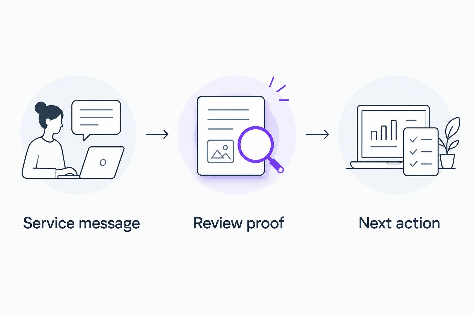
Plan your 2026 page around the job the visitor needs done. A review supports the decision; the phone or booking action completes the path.
- Service message: State the work you do and the area you serve.
- Review proof: Show relevant customer feedback with its source.
- Next action: Give the visitor a clear call or booking option.
Keep 1 primary next action within each focused section. That is a layout rule for this recommendation, not a claim that every visitor behaves the same way.
Use the same logic on HVAC, roofing, and landscaping pages. A furnace-repair page needs furnace-repair context, not a random collection of praise. Keep location claims accurate whether your business serves Omaha, Des Moines, Denver, or Chicago.
How the formats rank
Compact cards rank first because the review stays visible without an interaction. Service-specific reviews win on relevance. Sliders trade visibility for a smaller footprint, while feeds trade page restraint for a broader collection.
Static testimonials earn a place because direct editorial control is a legitimate need. Their limitation is maintenance, not appearance. These rankings judge layout and upkeep; they do not claim measured conversion gains or compare software performance.
Which review widget should you choose?
Choose compact review cards unless your page has a specific reason to use another format. Add service-specific reviews where you have relevant feedback, and reserve a full feed for visitors who want to read further.
When discussing review widgets with Moore Media Collective, include the surrounding website layout in the brief. Ask for a proposed placement, mobile preview, source treatment, and update plan. Require your approval before any change goes live.
Plan your plumbing website update
Discuss website design, branding, and where customer reviews belong.
FAQ
What are the best review widgets for plumbing company websites?
Compact review cards are the best default format for plumbing homepages. Use service-specific reviews on individual service pages and a larger feed on a dedicated reviews page.
Should I use a review slider or review cards?
Choose review cards when you want feedback visible without interaction. Use a manual slider only when the section needs a smaller footprint, and make the first review useful on its own.
Can I copy customer reviews onto my plumbing website?
Check the review source’s reuse rules and applicable permissions before copying customer feedback. Preserve attribution, avoid misleading edits, and distinguish selected testimonials from a complete review record.
Will adding a review widget improve my Google rankings?
A review widget alone does not establish a ranking improvement. Choose the display for readable customer proof, and assess search performance separately from the widget’s appearance.
How many reviews should I show on my homepage?
Start with 3 compact cards as a design draft, not a performance target. Remove repetitive selections and check that the section remains readable on a phone.
Does Moore Media Collective sell a review-widget product?
Moore Media Collective provides logo design, branding, websites, and social media management for trade companies. Discuss review placement as part of the website design brief rather than treating the agency as a standalone widget vendor.
What should I test before publishing a review widget in 2026?
Test mobile readability, keyboard controls, source attribution, and the nearby call or booking action. For connected feeds, also check what visitors see when the connection fails, then approve the finished layout before publication.
One last thing
Check the page with the review widget unavailable. Can a homeowner still identify your plumbing service, service area, and phone number? If not, the widget is carrying information that belongs in the website itself.
Customer praise should reinforce a clear offer. It should never be the only thing explaining why someone should call.