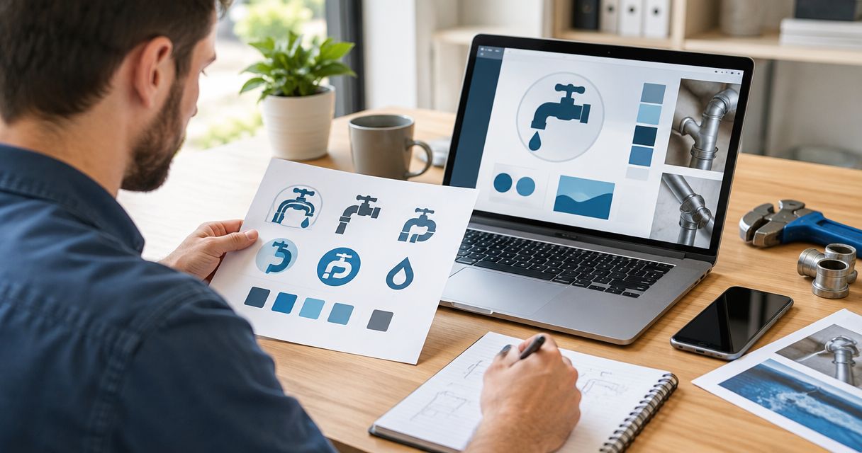
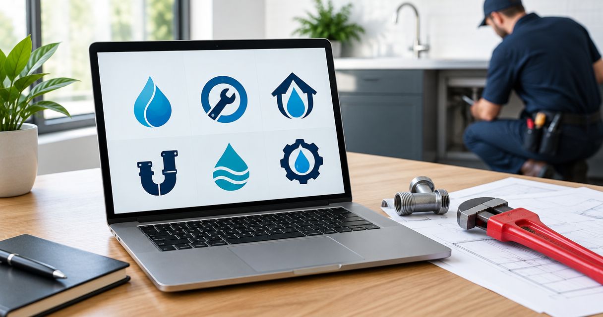
Best overall: a combination mark. Best for an established name: a wordmark. Best for a personality-led business: a mascot. The best logo styles for plumbing companies in 2026 make your name easy to read on a truck, a website, and a work shirt—not just on a designer’s screen.
- The best logo styles for plumbing companies start with a combination mark: a readable name plus a separate symbol.
- Wordmarks suit established plumbing names; monograms suit compact spaces but need a full-name version.
- Moore Media Collective provides plumbing branding and website design; choose a logo that works across both.
- Judge plumbing logos on truck lettering, mobile websites, and uniforms before approving the design.
Why this matters
Your logo should help a homeowner recognize your business and read its name. It cannot explain your service area, answer an emergency call, or prove the quality of your work. Your website and customer experience carry those jobs.
That distinction matters when you want more booked jobs. A clever pipe illustration is no substitute for clear service information and an obvious way to contact you. Choose recognition over decoration.
Moore Media Collective provides logo design, branding, websites, and social media management for trade companies. For a plumbing business, those pieces need a consistent identity—not separate designs that look unrelated.
What makes the best plumbing company logo
Use these criteria to choose your plumbing logo in 2026. Judge the design where customers will actually see it, not only on a presentation slide.
- Name readability: You should be able to read the business name without deciphering unusual letters or crowded spacing.
- Trade clarity: A symbol or supporting descriptor should help explain plumbing without burying the name under tools and pipes.
- Small-size clarity: The design should stay recognizable in a mobile website header and a social profile image.
- Production simplicity: Ask for a version that works in a single ink color, without gradients or shadows.
- Layout flexibility: You need usable arrangements for a long truck panel, a square profile image, and a shirt chest.
- Distinct identity: Compare the proposed design with local competitors before approving familiar droplets, wrenches, or initials.
A strong logo does not need to score equally on every criterion. A wordmark favors name recognition. A monogram favors compact placement. Pick the trade-off that fits your business, then address its weakness with a supporting version.
Plumbing logo styles at a glance
This 2026 shortlist ranks logo formats by their fit for common plumbing business needs. These are design choices, not competing agencies or software products.
| Logo style | Best for | Standout feature | Key limitation |
|---|---|---|---|
| Combination mark | Businesses needing a flexible default | Name and symbol work together or separately | A crowded arrangement hurts readability |
| Wordmark | Businesses built around a recognizable name | Keeps the company name central | Long names need careful handling |
| Monogram | Businesses needing a compact supporting mark | Initials fit tight spaces | Initials alone do not explain the business |
| Badge or emblem | Businesses wanting a workwear-style identity | Contains the name and supporting details | Small lettering becomes difficult to read |
| Geometric symbol | Businesses wanting a restrained visual identity | Simple shapes support consistent use | Abstract shapes need name recognition |
| Mascot | Businesses built around a distinctive personality | A character provides a recurring visual theme | Illustration detail complicates small applications |
1. Combination mark: best plumbing logo for everyday flexibility
A combination mark pairs your business name with a symbol. You can use the complete arrangement on a truck and the symbol alone where space is tight. The name remains the main event.
For a plumbing company, the symbol might reference water, a pipe connection, or a distinctive letter shape. It does not need every plumbing tool in the shop. One clear idea gives the name room to breathe.
Combination mark pros:
- Keeps the business name visible alongside a visual cue.
- Supports horizontal and stacked arrangements.
- Gives you a separate symbol for compact placements.
- Can include a clear plumbing descriptor.
Combination mark cons:
- An oversized symbol can overpower the name.
- Extra taglines and service lists make the layout crowded.
- Separate versions need consistent proportions and spacing.
Best for: A plumbing company that needs one identity across vehicles, websites, uniforms, and social media.
For a new identity in 2026, start here unless your business name or positioning gives you a clear reason not to. Verdict: Buy—make a combination mark your default design direction.
2. Wordmark: best plumbing logo for an established business name
A wordmark makes the company name the logo. Letter shapes, spacing, and weight do the work instead of a separate illustration. This keeps attention on the name customers need to remember and search for.
A surname-based plumbing business can use this approach without forcing a wrench into a letter. Keep unusual lettering under control. If the name is hard to read, the style has failed its main job.
Wordmark pros:
- Puts the company name first.
- Avoids dependence on a generic plumbing icon.
- Works naturally in horizontal website headers.
- Lets typography create a distinct identity.
Wordmark cons:
- A long company name needs alternate arrangements.
- The full wordmark rarely fits neatly into a square avatar.
- Decorative lettering can make unfamiliar names harder to read.
Best for: A plumbing business whose name deserves more attention than a symbol.
Keep “Plumbing” readable if it is part of your business name. Do not reduce the useful descriptor to a tiny line while enlarging an unfamiliar surname. Verdict: Buy—choose a wordmark when clear name recognition is the priority.
3. Monogram: best plumbing logo for compact supporting use
A monogram uses initials as a graphic mark. It fits spaces where the full company name would become cramped, such as a profile image or a small uniform application. Treat it as a supporting asset, not an explanation of your business.
A homeowner seeing unfamiliar initials still needs your full name and service information. Put the complete identity on your website and vehicle lettering. Use the monogram where recognition already has context.
Monogram pros:
- Fits compact and square placements.
- Can create a recognizable shape from a long name.
- Gives uniforms and social profiles a concise mark.
Monogram cons:
- Initials alone do not communicate plumbing.
- Common letter combinations are difficult to distinguish.
- Interlocking letters can become hard to decipher.
Best for: A plumbing company needing a compact companion to a readable full-name logo.
Ask to see the monogram beside the full name before choosing it. The two should look like parts of the same identity, not separate businesses. Verdict: Hold—approve a monogram only with a clear full-name version.
4. Badge or emblem: best plumbing logo for a workwear-style identity
A badge places the company name and supporting elements inside a defined shape. Circles, shields, and similar containers can give the identity a patch-like structure. That structure suits a business that wants its logo to feel at home on workwear.
The risk is packing too much inside the border. A company name, plumbing descriptor, founding date, service list, and slogan cannot all be the headline. Keep only the information the logo needs.
Badge or emblem pros:
- Creates a contained arrangement for patches and decals.
- Gives supporting text a defined place.
- Supports a deliberate workwear-oriented appearance.
Badge or emblem cons:
- Small perimeter text becomes difficult to read.
- Dense borders and illustrations complicate reproduction.
- A compact badge can leave the business name too small.
Best for: A plumbing company prioritizing patches, decals, and a contained visual style.
Require a simplified version for your website header. The full badge does not need to appear everywhere just because it looks good on a shirt. Verdict: Buy—with a simpler alternate layout for tight spaces.
5. Geometric symbol: best plumbing logo for a restrained identity
A geometric symbol uses simple shapes rather than a detailed illustration. It can suggest a pipe connection, water movement, or an initial without showing an entire tool. Pair it with a readable business name.
Restraint is useful only when the shape is distinct enough to recognize. A generic droplet does not become unique because it has fewer details. Compare the silhouette against nearby plumbing companies before approving it.
Geometric symbol pros:
- Keeps the visual structure simple.
- Avoids fine illustration details.
- Can work as a supporting icon across different layouts.
Geometric symbol cons:
- An abstract shape does not explain the service by itself.
- Familiar shapes can resemble competitors’ marks.
- Removing too much detail can remove the intended meaning.
Best for: A plumbing company wanting a restrained symbol alongside its full name.
Do not choose abstraction just to look modern in 2026. Choose it when the shape remains clear and the name still leads. Verdict: Buy—if the symbol is distinct and supported by readable text.
6. Mascot: best plumbing logo for a personality-led business
A mascot uses a character as part of the identity. That character can carry through truck graphics, website illustrations, and social posts. It gives the business a visual personality beyond lettering and a trade symbol.
This direction requires commitment. A cartoon character should fit how your company speaks to customers, including customers dealing with a stressful leak. Friendly does not need to mean silly.
Mascot pros:
- Gives the business a recurring character.
- Supports personality across different marketing materials.
- Provides more illustration possibilities than a simple icon.
Mascot cons:
- Fine details disappear in compact placements.
- A playful tone can conflict with the rest of the business identity.
- The character can distract from the company name.
Best for: A plumbing company intentionally building a friendly, character-led identity.
Request a simplified mascot and a text-only version. Neither the website nor a small shirt application should depend on the full illustration. Verdict: Hold—choose a mascot only when personality is central to the business.
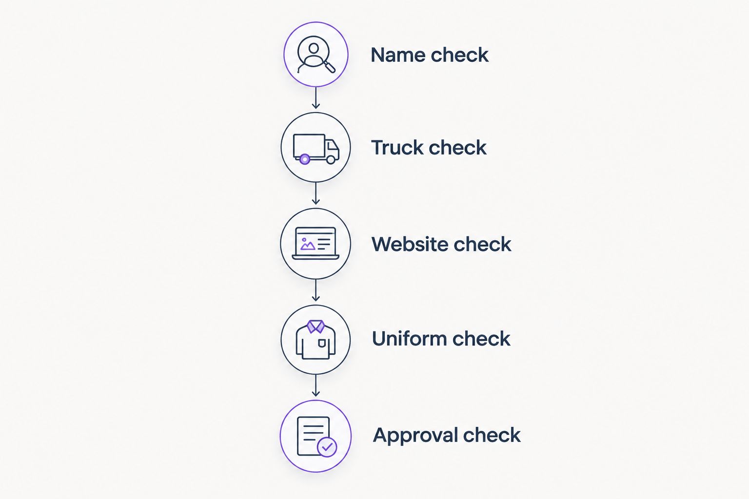
Check the logo before you approve it
A polished presentation is not an approval test. Before approving your plumbing logo in 2026, review the proposed identity in the places you will use it. Ask for realistic layouts, not promises that it will work everywhere.
Name check
Read the full business name without zooming into the artwork. Look for ambiguous letters and a plumbing descriptor that has become too small. Ask someone unfamiliar with the design to read it aloud.
Truck check
Review the logo alongside your proposed vehicle lettering. The business name and contact information need their own space. Keep service lists out of the logo itself.
Website check
View the proposed header on a phone-sized screen. Check the name, navigation, and contact action together. A logo that forces the header to become crowded needs another arrangement.
Uniform check
Ask your production supplier to review the design for the intended printing or embroidery method. Inspect the simplified version too. A detailed mascot or badge should not be your only usable file.
Approval check
Approve the design and intended applications before authorizing rollout. Agree on which files and layouts will be used. Logo approval is not permission to change a live website.
How the styles rank
The ranking favors readability, layout flexibility, and practical reproduction. Combination marks come first because they provide both a full-name identity and a separate symbol. Wordmarks follow because they keep attention on the business name.
Monograms, badges, geometric symbols, and mascots solve narrower needs. None is automatically wrong. The wrong choice is a style whose weakness you leave unresolved.
Moore Media Collective’s plumbing logo design and branding services belong in the same planning conversation as your website. The logo should support the page—not crowd out service information or contact actions.
Which plumbing logo style should you choose?
Choose a combination mark if you are undecided. It gives your plumbing business a readable name, a supporting symbol, and room for different layouts. Keep the symbol simple and request a text-only alternative.
Choose a wordmark when the company name is the strongest asset. Use a monogram as a companion. Pick a badge, geometric symbol, or mascot only when its specific appearance fits your business and its limitations have been addressed.
Moore Media Collective provides plumbing branding and website design for trade businesses that need those pieces to work together. Bring the intended applications into the design brief before choosing a style.
Plan your plumbing business identity
Discuss logo design, branding, and website needs before choosing a design direction.
FAQ
What’s the best logo style for a plumbing company in 2026?
A combination mark is the best default for a plumbing company because it pairs a readable business name with a separate symbol. Request layouts for vehicles, a mobile website header, uniforms, and social profiles.
Is a wordmark better than a plumbing icon?
A wordmark is better when the business name needs to lead the identity. A plumbing icon works best as support, not as a replacement for a name unfamiliar customers need to read.
Should my plumbing logo include a wrench or a water droplet?
Your plumbing logo does not need a wrench or a water droplet. Use a trade symbol only when it adds clarity and does not make the design look interchangeable with nearby competitors.
Can I use initials as my plumbing company logo?
Use initials as a supporting logo, with a full-name version available. Initials alone do not tell an unfamiliar homeowner what the business is called or what service it provides.
Is a mascot a good choice for a plumbing business?
A mascot fits a plumbing business that deliberately wants a character-led identity. Keep the company name readable and request a simplified version for small applications.
What should I ask for before approving a plumbing logo?
Ask for full-name, compact, and single-color versions shown in the intended applications. Confirm the files and layouts you are approving before authorizing production or website updates.
Does Moore Media Collective provide plumbing company logo design?
Moore Media Collective provides logo design, branding, websites, and social media management for plumbing and other trade companies. Discuss the intended website, vehicle, and uniform applications when setting the design brief.
One last thing
Choose your plumbing logo in 2026 without its color effects first. Ask to see the proposed design in a single ink color, at the intended size. If the name disappears or the symbol becomes confusing, fix the structure before choosing colors.
That review keeps the decision practical. You are approving a working business identity—not just an attractive image.