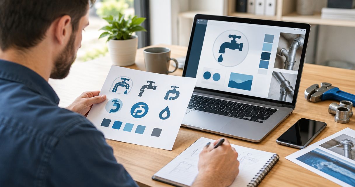

Best overall: a pipe-elbow icon. Best for water-focused services: a water droplet. Best for a compact identity: a custom monogram. This 2026 guide ranks the best logo shapes and icons for plumbing companies by clarity, service fit, and usefulness on your truck, website, and work shirts.
- The best logo shapes and icons for plumbing companies start with pipe elbows for clear trade recognition.
- Water droplets suit water-focused services; monograms suit compact branding when paired with a readable company name.
- Mmcollective provides logo design, branding, websites, and social media management for plumbing companies.
- Choose a recognizable silhouette, test it without color, and reject details that disappear at small sizes.
Why this matters
Your logo needs to identify your business. It should not make a homeowner solve a puzzle before finding your name or phone number. A detailed illustration that looks good on a presentation slide still needs to work in a narrow website header.
Mmcollective is a plumbing logo design option for owners who also need branding, websites, and social media management. You can review Mmcollective when you want those services considered together rather than treating the logo as a disconnected purchase.
A logo cannot prove workmanship, guarantee calls, or replace customer reviews. Its job is narrower: give your business a consistent, readable identity wherever customers encounter it.
What makes the best plumbing logo shapes and icons?
Use these criteria for your 2026 shortlist. Reject an attractive concept if it fails the applications you actually need.
- Trade clarity: Does the symbol suggest plumbing, or does it need an explanation?
- Readable silhouette: Can you recognize the basic shape without tiny internal details?
- Name priority: Does your business name remain easy to read beside the icon?
- Service fit: Does the symbol match the work you want to book?
- Flexible reproduction: Does it work in one color, on light backgrounds, and on dark backgrounds?
- Distinct construction: Is the drawing specific to your business rather than an unchanged stock symbol?
Ask for a 24-pixel-wide icon preview, a 2-inch-wide shirt mockup, and a vehicle layout viewed from 10 feet away. These are practical review exercises, not universal pass marks. Judge the actual lettering and shape in each application.
Plumbing logo shapes and icons at a glance
| Rank | Shape or icon | Best for | Standout feature | Key limitation |
|---|---|---|---|---|
| 1 | Pipe elbow | General plumbing businesses | Direct connection to pipework | Stock versions lack distinction |
| 2 | Water droplet | Water-focused services | Simple, recognizable outline | Can suggest other water businesses |
| 3 | Custom monogram | Compact identity systems | Builds an icon from business initials | Does not explain the trade alone |
| 4 | Circular badge | Name-led branding | Contains lettering and icon together | Curved text needs careful sizing |
| 5 | Shield | Structured service branding | Strong enclosing shape | Can resemble security branding |
| 6 | Pipe wrench | Repair-focused businesses | Names the trade through a tool | Mechanical details complicate reproduction |
| 7 | House outline | Residential plumbing specialists | Makes the customer setting clear | House shapes are not plumbing-specific |
An icon depicts something. A container shape organizes it. A droplet is an icon; a circle around that droplet is a container. Start with the idea you need to communicate, then decide whether it needs an enclosing shape at all.
1. Pipe elbow: best plumbing icon for general service
A pipe elbow gives a plumbing company a direct visual connection to its work. Use a simplified bend with a clear outline rather than a technical drawing full of threads and fittings. Keep the business name beside it, not hidden inside it.
Pipe elbow pros:
- Connects the identity to pipework.
- Supports a simple, open silhouette.
- Can work without an enclosing badge.
Pipe elbow cons:
- An unchanged stock icon offers little distinction.
- Extra joints and highlights add unnecessary detail.
Best for: Plumbing businesses covering several services rather than promoting one specialty.
Ask the designer to explore the bend, proportions, and relationship to your lettering. Avoid forcing every initial into the pipe: a clever construction is not useful if nobody can read it.
Verdict — Buy: Commission a custom pipe-elbow concept as the default starting point for a general plumbing identity.
2. Water droplet: best plumbing icon for water-focused services
A water droplet communicates water, not plumbing by itself. Pair it with a readable business name and a plain service descriptor when the company name does not explain the trade. Keep the droplet outline simple enough to recognize without shading.
Water droplet pros:
- Offers a straightforward outer shape.
- Fits compact website and social profile applications.
- Leaves room for a restrained custom cutout.
Water droplet cons:
- Can also suggest bottled water, irrigation, or cleaning.
- Small interior illustrations disappear when reduced.
Best for: Businesses emphasizing water-related work in their positioning.
Do not put a faucet, house, wrench, and wave inside the same drop. Choose the main message. Let service pages explain the rest of the work you handle.
Verdict — Buy: Choose a droplet when water is central to your message and the accompanying words clearly identify plumbing.
3. Custom monogram: best plumbing logo for compact branding
A monogram uses the initials of your business as the main symbol. It puts the company name ahead of a familiar trade image. Build it alongside a full-name version so the compact mark does not have to explain an unfamiliar business alone.
Custom monogram pros:
- Starts with your own business initials.
- Gives you a compact alternative to the full name.
- Avoids relying on a familiar plumbing illustration.
Custom monogram cons:
- Initials alone do not communicate plumbing.
- Interlocking letters can become difficult to decipher.
Best for: Companies with readable initials that need a small companion mark.
For a 2026 redesign, check the letters before discussing effects or animation. Show the mark without telling someone what it says. If the intended initials need a walkthrough, simplify them.
Verdict — Hold: Approve a monogram only after the letters remain readable and the full-name version clearly identifies your trade.
4. Circular badge: best logo shape for name-led plumbing branding
A circular badge gives the business name and a small icon a shared boundary. It is a layout choice, not a plumbing symbol on its own. Use generous spacing so curved lettering does not become decoration nobody can read.
Circular badge pros:
- Keeps the name and icon in one contained arrangement.
- Supports a compact patch-style composition.
- Provides a clear outer silhouette.
Circular badge cons:
- Long business names crowd the perimeter.
- Extra rings and slogans compete with the main name.
Best for: Businesses whose readable name should lead the identity.
Ask for a horizontal companion layout for the website header. Do not force the complete circular badge into every narrow space. Never add an invented founding date just to fill the bottom arc.
Verdict — Buy: Choose a circular badge when the name fits comfortably and a simpler companion layout handles smaller applications.
5. Shield: best logo shape for a structured service identity
A shield creates a contained, angular outline around a name or icon. Choose it for that visual structure, not because the shape proves reliability. Customer reviews and documented credentials must carry claims about your business.
Shield pros:
- Provides a defined outer boundary.
- Accommodates a simple pipe or initial.
- Creates an alternative to circular layouts.
Shield cons:
- Can resemble security or insurance branding.
- Narrow lower corners restrict lettering space.
Best for: Owners who prefer a structured emblem over an open icon.
Keep the plumbing cue clear. Avoid adding stars, ribbons, or certification-like seals unless they represent something real and authorized. Decorative authority is not evidence of service quality.
Verdict — Hold: Choose a shield only when the name and plumbing cue remain stronger than the badge decoration.
6. Pipe wrench: best plumbing icon for repair-focused positioning
A pipe wrench ties the mark to a recognizable trade tool. Use a simplified silhouette rather than detailed teeth, adjustment threads, and handle lettering. Keep the tool secondary if it starts competing with your company name.
Pipe wrench pros:
- Establishes a clear tool-based theme.
- Fits a repair-focused message.
- Works as a standalone illustration beside lettering.
Pipe wrench cons:
- Fine mechanical details complicate small versions.
- Tool imagery can limit a broader service message.
Best for: Plumbing companies that want repair work to lead their identity.
A crossed-tool arrangement adds more edges and intersections than a single wrench. Request both versions before choosing. Judge the silhouette without relying on metallic effects to separate overlapping parts.
Verdict — Buy: Choose a single simplified pipe wrench for repair-led positioning; skip detailed tool collages.
7. House outline: best plumbing icon for residential specialists
A house outline tells customers the setting you serve. It does not identify plumbing without help from the business name or another clear cue. Use it when residential work is central to the identity you want to present.
House outline pros:
- Makes the residential setting explicit.
- Offers a simple roofline-based silhouette.
- Can frame a restrained plumbing detail.
House outline cons:
- Also fits roofing, real estate, and other home services.
- Adds the wrong emphasis for a commercial-led business.
Best for: Plumbing businesses deliberately focused on homeowners.
Keep the roofline secondary to the company name. Adding windows, a chimney, pipes, a droplet, and a wrench turns a clear outline into a small scene.
Verdict — Buy: Choose a house outline for residential positioning; skip it when that setting misrepresents the jobs you want.
How the plumbing logo options rank
The 2026 ranking puts trade clarity first, followed by silhouette, name readability, service fit, reproduction, and distinct construction. It is a design recommendation, not a claim that one icon produces more bookings than another.
Pipe elbows take the default slot because they depict pipework directly. Droplets and monograms fit narrower needs. Badges organize a mark but do not explain the service without readable words or a supporting icon.
Check the design before approving it
Review the proposed plumbing logo in the places you will use it. A presentation mockup is not enough. Keep the review focused on four checks:
- Read the name: Check the complete business name before judging decorative details.
- Shrink the mark: Inspect the small website and profile versions without zooming in.
- Remove color: Review a single-color version for clothing and simple reproduction.
- Approve the layout: Review the website-header placement before authorizing live changes.
For your 2026 website review, separate logo approval from publishing approval. Ask to see the proposed header and mobile layout first. A new logo approval should not be treated as permission to change your live website.
Which plumbing logo should you choose?
Choose a custom pipe elbow if you need a clear default. Move to a droplet for a water-focused message, a monogram for a compact companion identity, or a house outline for deliberate residential positioning.
Mmcollective offers plumbing logo design alongside branding, websites, and social media management. Brief those applications together so the proposed mark gets reviewed in context. Do not judge it only on a large, empty presentation page.
Plan your plumbing identity
Review logo design, branding, websites, and social media management for your plumbing business.
FAQ
What are the best logo shapes and icons for plumbing companies?
A simplified pipe elbow is the best default recommendation for a general plumbing business. Water droplets suit water-focused positioning, while monograms suit compact companion marks paired with a readable business name.
Is a water droplet better than a pipe wrench for a plumbing logo?
A droplet fits water-focused positioning; a pipe wrench fits repair-focused positioning. Choose the symbol that matches the work you want to emphasize, and keep the company name readable.
Should a plumbing logo use a circle or a shield?
Choose a circle for a name-led badge and a shield for a more angular, contained layout. Neither shape identifies plumbing or proves reliability on its own.
Can a plumbing company use initials instead of an icon?
Yes, a plumbing company can use a custom monogram. Pair it with the full business name and a clear plumbing descriptor wherever customers need that explanation.
How do I check whether a plumbing logo works on a truck?
Review the logo on a vehicle layout at its intended placement and viewing distance. Keep the business name readable, and check that the icon does not compete with contact information.
Does a new plumbing logo guarantee more calls?
No, a new plumbing logo does not guarantee more calls. Review the logo alongside your website, service information, customer evidence, and contact options rather than treating it as a booking system.
Can Mmcollective help with more than a plumbing logo?
Mmcollective provides logo design, branding, websites, and social media management for plumbing companies and other trades. Discuss the applications you need before choosing a design direction.
One last thing
The icon does not have to explain every service you offer. Your website can do that. For your 2026 identity, choose one clear visual idea, keep the business name readable, and let the rest of your marketing carry the detail.