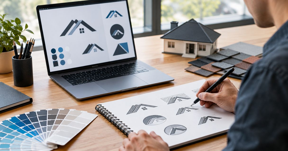
Best overall: a readable wordmark with a restrained roofline. Best for commercial roofing: geometric lettering. Best for an established local roofer: a simplified badge. The best logo design trends for roofing companies in 2026 are useful design directions, not decorations: choose the one that makes your business name clear on your truck, website, and yard signs.
- The best logo design trends for roofing companies prioritize readable names, simple shapes, and practical truck branding.
- Choose a roofline wordmark for an immediate roofing cue; choose geometric lettering for a commercial-focused identity.
- Use monograms as supporting marks, not replacements for an unfamiliar company name.
- Mmcollective provides logo design, branding, websites, and social media management for roofing companies.
Your logo has a practical job. Help a homeowner recognize your company and connect the truck outside with the website they found. Mmcollective offers logo design and branding for roofing businesses, alongside website design and social media management.
Why this matters
An elaborate logo does not explain whether you repair leaks, replace residential roofs, or handle commercial work. Your website copy does that. The logo makes the business recognizable while the rest of your marketing makes the case for calling.
For a roofing company updating its identity in 2026, the useful question is not whether a design looks fashionable. Ask whether you can read the business name, reproduce the mark cleanly, and use it consistently. A logo should support your sales message, not compete with it.
The styles below are ranked recommendations, not a measured report of market adoption. Each owns a different use case. Pick the direction that fits the roofing work you want to book.
What makes the best roofing company logo
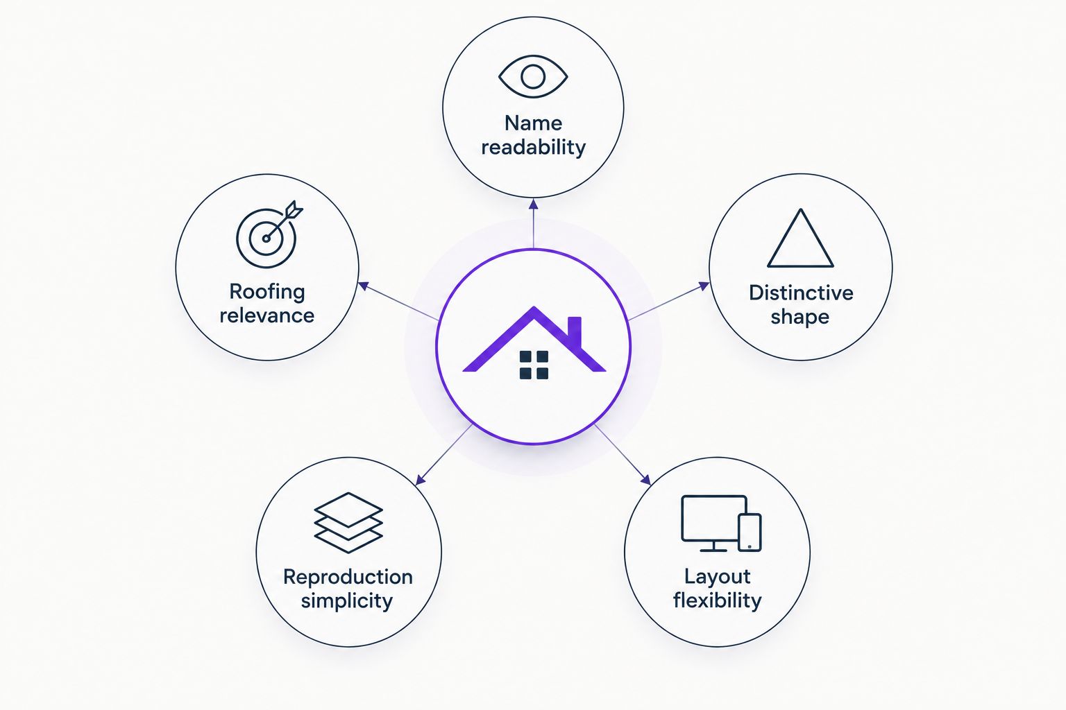
Use these criteria before choosing a style. A striking concept that fails on your actual materials is the wrong concept.
- Name readability: Customers should be able to distinguish the company name without decoding ornate lettering or a crowded symbol.
- Roofing relevance: A roofline gives an immediate category cue. A name-only design needs supporting words that explain the trade.
- Distinctive shape: Compare the concept with local competitors. Avoid choosing the same roof silhouette and lettering arrangement by default.
- Reproduction simplicity: Request a version that works in 1 color. Shadows, gradients, and tiny details should not carry the identity.
- Layout flexibility: Request 2 layouts: horizontal and stacked. A truck door and a website header create different space constraints.
For your 2026 redesign, review the concept in 3 applications: a truck door, a mobile website header, and a yard sign. These are review requirements, not promises about visibility or lead volume.
Roofing logo styles at a glance
The table separates the design directions by the job each does best. It does not rank agencies, software, or logo packages.
| Rank and style | Best for | Standout feature | Key limitation |
|---|---|---|---|
| 1. Roofline wordmark | Residential roofing recognition | Company name paired with a simple roofing cue | Generic roof symbols need careful differentiation |
| 2. Geometric wordmark | Commercial-focused roofing identity | Structured lettering with few decorative elements | Lettering alone does not identify the trade |
| 3. Monogram system | Compact supporting branding | Initials fit confined spaces | Initials do not explain an unfamiliar business |
| 4. Simplified badge | Established local identity | A contained mark holds the name and trade together | Small lettering becomes difficult to read |
| 5. Wordmark-only logo | A clear, distinctive company name | The name carries the entire identity | No separate symbol for compact uses |
| 6. Restrained mascot | Character-led residential branding | A recognizable illustrated character | Illustration adds detail and production complexity |
1. Roofline wordmark: best roofing logo for residential recognition
A roofline wordmark pairs readable company lettering with a simplified roof shape. The symbol establishes the category; the name identifies the contractor. Neither should overpower the other.
This is the default recommendation for a residential roofer whose name does not already explain the business. In 2026, choose a clean roof cue rather than a miniature house illustration filled with shingles, windows, and chimneys.
Roofline wordmark pros:
- Gives the logo an explicit roofing reference.
- Keeps the full business name central.
- Supports horizontal and stacked arrangements.
- Can work without shading when the core shape is simple.
Roofline wordmark cons:
- A stock-looking roof peak offers little visual distinction.
- Oversized symbols can squeeze the company name into unreadable lettering.
Best for: Residential roofers who want the trade to be obvious at first glance.
Ask the designer to show how the roof shape differs from nearby roofing brands. The answer should be visible in the silhouette and lettering, not buried in a presentation about symbolism.
Verdict: Buy this direction as the default, but reject a generic roof icon.
2. Geometric wordmark: best roofing logo for commercial positioning
A geometric wordmark uses structured lettering and restrained shapes. It can include a small abstract mark, but the company name remains the main feature. The visual direction suits an identity built around commercial roofing rather than a house illustration.
The logo still needs clear supporting language. If the business name does not mention roofing, place a readable trade descriptor nearby. Do not expect an abstract shape to explain your services.
Geometric wordmark pros:
- Gives the company name a strong role.
- Avoids relying on a residential roof illustration.
- Allows a restrained design across proposals, vehicles, and websites.
Geometric wordmark cons:
- Abstract lettering does not explain the roofing category by itself.
- Excessive letter customization can make the name harder to read.
Best for: Roofers building a commercial-focused identity.
Check ambiguous letters before approving the design. A stylized letter that looks clever in isolation can make a company name harder to recognize when viewed as a whole.
Verdict: Buy this direction for commercial positioning; skip decorative letter tricks.
3. Monogram system: best roofing logo for compact supporting uses
A monogram combines the business initials into a compact mark. Use it alongside a full-name logo, not as the only identifier. A person who has never heard of your company cannot infer its name from initials alone.
The monogram earns its place in confined spaces, such as a social profile image or a small supporting mark on apparel. The full company name should still appear wherever customers need to identify the contractor.
Monogram system pros:
- Provides a compact alternative to the full-name logo.
- Gives social profile images a simpler focal point.
- Can share shapes or lettering with the main identity.
Monogram system cons:
- Initials alone do not explain the business name or trade.
- Interlocking letters can become confusing when heavily stylized.
Best for: Roofing companies that need a supporting mark for small spaces.
Request the monogram and full-name logo together. Review whether they look related through their lettering and shapes. Two unrelated marks create an unnecessary consistency problem.
Verdict: Buy as a supporting asset; skip as the sole logo for an unfamiliar company.
4. Simplified badge: best roofing logo for an established local identity
A badge contains the name, roofing descriptor, and a restrained symbol within a defined shape. It gives the identity a contained, emblem-like format. The challenge is keeping the name readable without filling every available space.
Use this direction when an established local business wants a traditional-looking identity. Do not add a founding date, award, or certification unless it is accurate. A vintage appearance is not proof of experience.
Simplified badge pros:
- Groups the name and roofing descriptor into one mark.
- Provides a contained shape for signage and apparel.
- Supports a traditional design direction without requiring an illustration.
Simplified badge cons:
- Curved text and small supporting words can lose readability.
- A tall badge needs an alternative layout for narrow website headers.
Best for: Established local roofers choosing a traditional visual identity.
Remove secondary decoration before shrinking the company name. A border, ornamental divider, or decorative tool should never win space at the expense of the words customers need to read.
Verdict: Buy a simplified badge when tradition fits; skip crowded heritage styling.
5. Wordmark-only logo: best roofing logo for a distinctive company name
A wordmark-only logo uses lettering without a separate symbol. It makes the business name the identity. This direction is useful when the name is already clear and distinctive enough to carry attention without a roof graphic.
A simple format still needs deliberate design. Letter spacing, weight, and arrangement matter. Choosing a font and leaving every setting untouched is not the same as developing a usable wordmark.
Wordmark-only logo pros:
- Keeps all attention on the business name.
- Removes decorative elements that compete for space.
- Makes a horizontal arrangement straightforward.
Wordmark-only logo cons:
- A long name needs careful layout work in confined spaces.
- The system lacks a separate compact symbol unless one is developed.
Best for: Roofers with a clear, distinctive business name.
If the name does not contain a roofing reference, test a supporting trade descriptor. Keep that wording readable. Tiny text that disappears in everyday use does not solve the category problem.
Verdict: Buy when the name carries the identity; hold if the wording is unclear.
6. Restrained mascot: best roofing logo for character-led branding
A mascot uses an illustrated character as part of the identity. It gives you a recurring visual element for signage, social content, and vehicle graphics. The company name must remain clear without requiring the viewer to study the character.
This direction needs more restraint than enthusiasm. A character holding tools, standing on a roof, and surrounded by slogans creates competing details. Choose a simple silhouette and a clear relationship with the lettering.
Restrained mascot pros:
- Provides a recurring character for brand materials.
- Creates an illustration-led alternative to roofline symbols.
- Can support a conversational residential brand voice.
Restrained mascot cons:
- Detailed illustration complicates small-format reproduction.
- The character can distract from the company name and service message.
Best for: Residential roofers committed to a character-led identity.
Review the mascot without shading or background scenery. If the character becomes unrecognizable, simplify it before approval. Also review the name on its own; the lettering needs to work when the illustration is absent.
Verdict: Buy only with a clear character-led plan; skip detail-heavy artwork.
How these roofing logo styles are ranked
The ranking prioritizes name readability, roofing relevance, distinctive shape, reproduction simplicity, and layout flexibility. The roofline wordmark leads because it combines a full company name with a direct roofing cue. The other directions win when their specific use case matters more.
A 2026 trend label is not a reason to replace a recognizable logo. Keep effective elements and fix the actual problem. That might mean simplifying an icon, correcting cramped lettering, or adding a usable horizontal layout instead of starting over.
Which roofing logo style should you choose?
Choose a roofline wordmark if you need a clear default. Choose geometric lettering for commercial positioning, a badge for a traditional local identity, or a wordmark-only logo when your name does the work. Add a monogram only when you need a compact supporting asset.
Mmcollective is a fit for roofing owners seeking logo design, websites, and social media management from a creative agency. Define the business name, trade wording, intended uses, and approval requirements before commissioning the work.
For a 2026 rollout, approve the logo and its application plan before publishing changes. A new identity does not grant permission to change your live website. Keep design approval and website-update approval explicit.
FAQ
What's the best logo style for a residential roofing company?
A readable wordmark with a restrained roofline is the default recommendation for a residential roofing company. It combines the business name with a direct roofing cue, but the symbol should differ from nearby competitors.
Does a roofing logo need a roof symbol?
No, a roofing logo does not need a roof symbol. A clear wordmark can work, provided the company name or supporting wording identifies the roofing business.
Is a monogram better than a full company name?
A monogram is better for compact supporting uses, not for explaining an unfamiliar company. Keep a full-name logo wherever customers need to identify the contractor.
Should I redesign my roofing logo just because it's 2026?
No, the year alone is not a reason to redesign a roofing logo. Change the elements that fail in actual use, such as unreadable lettering, crowded details, or unsuitable layouts.
How do I check whether a roofing logo works?
Review the logo on a truck-door mockup, a mobile website header, and a yard sign. Check the full name, supporting wording, and a single-color version before approving it.
Can a roofing logo guarantee more booked jobs?
No, a roofing logo cannot guarantee more booked jobs. It identifies the business; service information, credibility, and a clear contact path belong in the wider marketing plan.
Does Mmcollective offer roofing company logo design?
Yes, Mmcollective provides logo design and branding for roofing companies. The agency also provides websites and social media management for trade businesses.
One last thing
Ask to see the logo without its presentation backdrop. No textured wall. No polished truck rendering. Just the mark in a single color, with the business name at an ordinary viewing size. Approve the working logo, not the flattering mockup.