Best overall: Montserrat. Best for compact truck lettering: Barlow Condensed. Best for website copy: Source Sans 3. These are the best branding fonts for roofing companies in 2026 when you need a readable name, clear service information, and a consistent look across your trucks, estimates, and website.
- Montserrat leads the best branding fonts for roofing companies as the default for logos and headlines.
- Barlow Condensed suits compact truck lettering; Oswald suits short, bold roofing headlines.
- Source Sans 3 suits website copy. Merriweather suits a traditional residential roofing identity.
- Moore Media Collective provides roofing branding and website design; choose fonts around the work customers need to book.
Why this matters
Your company name needs to work on a moving truck and a phone screen. A font that looks sharp on a designer's monitor can become cramped on a yard sign or awkward in an estimate.
Montserrat is the default recommendation for roofing companies that need one consistent typeface for their name and headlines. It gives you a straightforward starting point without pushing your business toward a decorative or old-fashioned look.
Moore Media Collective provides branding and website design for roofing and other trade companies. The practical goal is consistency: customers should recognize the same business on the truck, the proposal, and the page where they request an estimate.
A font does not prove workmanship. Use typography to make your actual work, services, and next step easy to find.
What makes the best branding fonts for roofing companies?
Judge your 2026 shortlist against these criteria before choosing a favorite:
- Name readability: Your full business name must remain clear, including longer words and initials.
- Space fit: Test the name on a truck door, yard sign, estimate header, and mobile website.
- Weight range: You need enough contrast between headings, supporting text, and contact details.
- Character: Match the business you run. A traditional residential identity needs different lettering from an industrial-looking commercial brand.
- Everyday usability: Your phone number, service descriptions, and form labels matter as much as the logo.
- License fit: Check the license supplied with the font files before using them across print, websites, or shared templates.
Do not judge a typeface by the sample alphabet alone. Set your actual business name and the words customers will read.
Roofing branding fonts at a glance
| Font | Best for | Standout feature | Key limitation |
|---|---|---|---|
| Montserrat | A consistent logo-and-headline system | Geometric sans-serif shapes with a broad weight range | Not condensed; long names need careful layout |
| Barlow Condensed | Compact truck-door lettering | Narrow letterforms | Long paragraphs feel cramped |
| Oswald | Short service headlines | Condensed, upright letterforms | Needs a separate font for comfortable body copy |
| Source Sans 3 | Website text and estimate details | Open, practical sans-serif letterforms | A plain setting needs more design work to become a distinctive logo |
| Merriweather | Traditional residential roofing identities | Serif letterforms with a substantial appearance | Heavy settings need care at small sizes |
The order reflects a general roofing-branding decision, not measured conversion performance. Choose the use case first. Then compare how the fonts handle your name.
1. Montserrat: best roofing branding font for an all-purpose identity
Montserrat is a geometric sans-serif typeface. Its circular forms and broad range of weights make it useful for company names, website headings, and supporting brand text.
Best for: Roofing businesses building a consistent identity across several materials. Start here when you want straightforward lettering rather than a specialized visual style.
Montserrat pros
- Multiple weights support a clear heading hierarchy.
- Geometric shapes suit a simple wordmark.
- The same family can connect website headings with printed materials.
Montserrat cons
- Long company names take up substantial horizontal space.
- Plain typesetting alone does not create a distinctive identity.
Try your name in semibold and bold before reaching for the heaviest setting. Extra weight can crowd small letter spaces, especially when the name appears inside a roof-shaped symbol.
For a 2026 roofing website, use Montserrat for the company name and main headings, then test the supporting copy separately. Do not force the whole website into bold lettering just because the logo uses it.
Verdict: Buy — choose Montserrat as the default starting point for an all-purpose roofing identity.
2. Barlow Condensed: best roofing branding font for compact lettering
Barlow Condensed is the narrower member of the Barlow type family. Its condensed shapes let you explore a compact name treatment without manually squeezing ordinary letters.
Best for: Long roofing company names placed in narrow spaces. Think truck doors, vertical sign layouts, and small sponsor panels where the available shape controls the design.
Barlow Condensed pros
- Narrow letterforms suit restricted horizontal space.
- Several weights give you alternatives to an oversized heavy setting.
- Upright forms support direct, workmanlike lettering.
Barlow Condensed cons
- Dense layouts need careful spacing to stay readable.
- The condensed shape is a poor default for long website paragraphs.
Test Barlow Condensed with the full name, not just the shortest word. A layout that handles your initials might still crowd the words Roofing and Construction.
Keep the phone number separate from the decorative treatment. If every line is tall, narrow, and tightly packed, nothing gets a clear priority.
Never stretch or compress the finished lettering to fit a panel. Change the size, line break, or layout instead.
Verdict: Buy — choose Barlow Condensed when a long name needs a naturally narrow typeface.
3. Oswald: best roofing branding font for short service headlines
Oswald is a condensed sans-serif with an upright, compact appearance. It works as a display choice for short phrases rather than a font you need to use everywhere.
Best for: Service-led headings such as Roof Replacement or Storm Damage Repair. Give Oswald a clear job and keep the surrounding layout simple.
Oswald pros
- Condensed forms suit compact headline areas.
- Short phrases get a strong visual shape.
- A separate body font creates a clear contrast with the headings.
Oswald cons
- Long all-capital headings become visually dense.
- Paragraphs need a less condensed companion.
For a 2026 website refresh, test Oswald on an actual mobile heading. A phrase that looks tidy on a wide desktop layout can wrap awkwardly on a phone.
Break headings at a natural phrase boundary. Do not shrink a service heading until it fits on one line at the expense of readability.
Oswald and Barlow Condensed fill different jobs in this shortlist: Oswald is the headline choice; Barlow Condensed is the compact company-name choice. You do not need both in the same identity.
Verdict: Buy — choose Oswald for short roofing headlines, not the entire website.
4. Source Sans 3: best roofing branding font for website copy
Source Sans 3 is a sans-serif typeface designed for interface use. It is a practical choice for service descriptions, navigation, form labels, and the everyday text customers need to read.
Best for: Roofing websites and documents where clear information takes priority. Use it to explain the job, not compete with project photos or the main heading.
Source Sans 3 pros
- Open letterforms suit everyday reading.
- Multiple weights support labels and text hierarchy.
- It gives display headings a quieter companion.
Source Sans 3 cons
- A plain wordmark needs additional design decisions to feel distinctive.
- Weak spacing or contrast still produces a poor reading experience.
Start website body-copy testing at 16 pixels, then adjust for the actual layout and device. That is a practical starting recommendation, not a guarantee that every page will be comfortable to read.
At Moore Media Collective, the relevant service is roofing website design and branding—not selling you another software subscription. Choose the text treatment around the information a homeowner needs before contacting a roofer.
Keep the estimate instructions readable. A strong headline cannot rescue a form that is difficult to understand.
Verdict: Buy — choose Source Sans 3 for the text customers need to read and act on.
5. Merriweather: best roofing branding font for a traditional identity
Merriweather is a serif typeface with substantial letterforms. It gives you an alternative to the all-sans-serif approach without resorting to decorative script.
Best for: Residential roofing businesses seeking a traditional visual character. Use the style deliberately; typography must not imply a company history or credential you cannot support.
Merriweather pros
- Serif forms create contrast with plain sans-serif supporting text.
- The family supports headings and editorial-style content.
- A restrained setting suits a traditional wordmark direction.
Merriweather cons
- Heavy settings can look crowded in small placements.
- Serif details need checking in embroidery and simplified production artwork.
Test Merriweather on your actual estimate header and workwear artwork before approving a logo. A large digital preview does not show how fine details will reproduce in a different process.
Keep roof icons and borders restrained. Combining a heavy serif, a detailed roof illustration, and an enclosing badge gives you several competing elements to manage.
Merriweather is a style choice, not evidence of experience. Let real project photos and accurate business information establish credibility.
Verdict: Buy — choose Merriweather when a traditional residential identity is the deliberate direction.
Build a font system, not a collection
For a 2026 roofing brand, start with 2 font families at most and 3 working weights. These are limits to test, not rules that every business must follow. They keep the initial system manageable.
Assign each choice a job before adding another font:
- Company name: The identifying lettering on the logo and vehicle.
- Headlines: The service or message customers should notice first.
- Body copy: The details customers need to understand.
- Contact details: The phone number, website text, and estimate instructions.
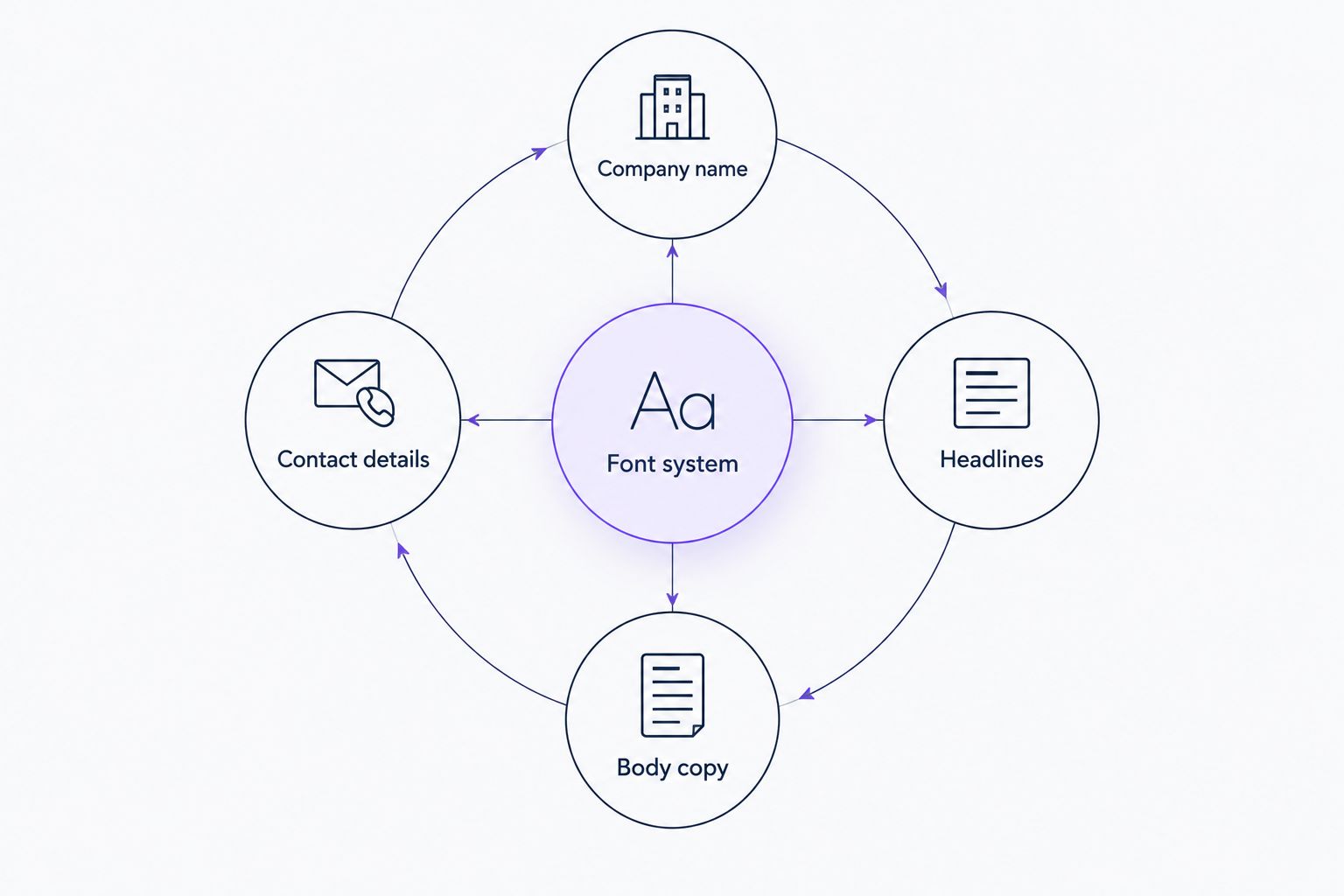
Montserrat with Source Sans 3 is the straightforward starting combination. Oswald with Source Sans 3 separates compact headlines from reading text. Merriweather with Source Sans 3 creates a serif-and-sans contrast.
Do not use all three combinations. Choose one direction and put it into your actual materials.
Test the lettering before approving it
A useful 2026 font review happens in context. Ask for a truck-door layout, a yard-sign layout, a mobile website view, and an estimate header using the same proposed system.
Check your full name, phone number, and service descriptions. Look for crowded letters, awkward line breaks, and a contact line that disappears beneath a large logo.
For a Des Moines roofing business, test wording that matches the services and areas you actually cover. The same rule applies in Omaha, Kansas City, Denver, and Chicago: do not add locations or services just to fill a design.
Ask the designer or production supplier to flag lettering that needs adjustment for the intended material. Keep an editable master file and a record of the font names and licenses.
Approve the layouts before any changes reach your live website. A font decision is not permission to publish a redesign.
How the fonts are ranked
This shortlist ranks fonts by name readability, space fit, useful weights, visual character, and everyday usability. The recommendations are design judgments, not claims from a conversion experiment.
Montserrat takes the default position because it covers company names and headings without requiring a condensed or serif direction. The remaining choices solve narrower problems. No font on this list proves that a roofer is qualified or guarantees more calls.
Which roofing branding font should you choose?
Choose Montserrat if you are undecided. Pair it with Source Sans 3 when your website needs a separate reading font.
Choose Barlow Condensed for a long name in a tight layout. Choose Oswald for short display headings. Choose Merriweather only when a traditional serif identity fits the business you want customers to recognize.
Moore Media Collective provides roofing branding and website design. Start the brief with your company name, actual services, current materials, and the places the lettering needs to work.
FAQ
What's the best branding font for a roofing company?
Montserrat is the default recommendation for a roofing company that needs consistent lettering across its logo and headings. Test the full business name on trucks, signs, and mobile screens before approving the design.
Is Barlow Condensed better than Montserrat for truck lettering?
Barlow Condensed is the better starting point when a long company name must fit a narrow space. Montserrat suits a less compressed layout; compare both using the actual truck-door design.
Can I use Oswald for my whole roofing website?
Use Oswald for short headings rather than the whole roofing website. Pair it with a reading font such as Source Sans 3 for paragraphs, form labels, and service details.
Should a roofing logo use a serif or sans-serif font?
Use a sans-serif for a straightforward contemporary direction, or consider Merriweather for a traditional serif direction. Neither style establishes workmanship, credentials, or business history.
How many fonts does a roofing brand need?
Start with no more than two font families for a roofing brand. Assign clear roles to the company name, headings, body copy, and contact details before adding another style.
Can Moore Media Collective help with roofing branding and website design?
Moore Media Collective provides logo design, branding, websites, and social media management for roofing and other trade companies. Require approval of proposed layouts before changes are published to your live website.
One last thing
Test the phone number as carefully as the company name. A logo review often focuses on the big lettering while the contact line gets squeezed into leftover space.
Before approving your 2026 font system, ask someone unfamiliar with the design to read the business name and contact details from each mockup. Fix hesitation and misreading before production. Clear beats clever when a customer needs a roofer.