
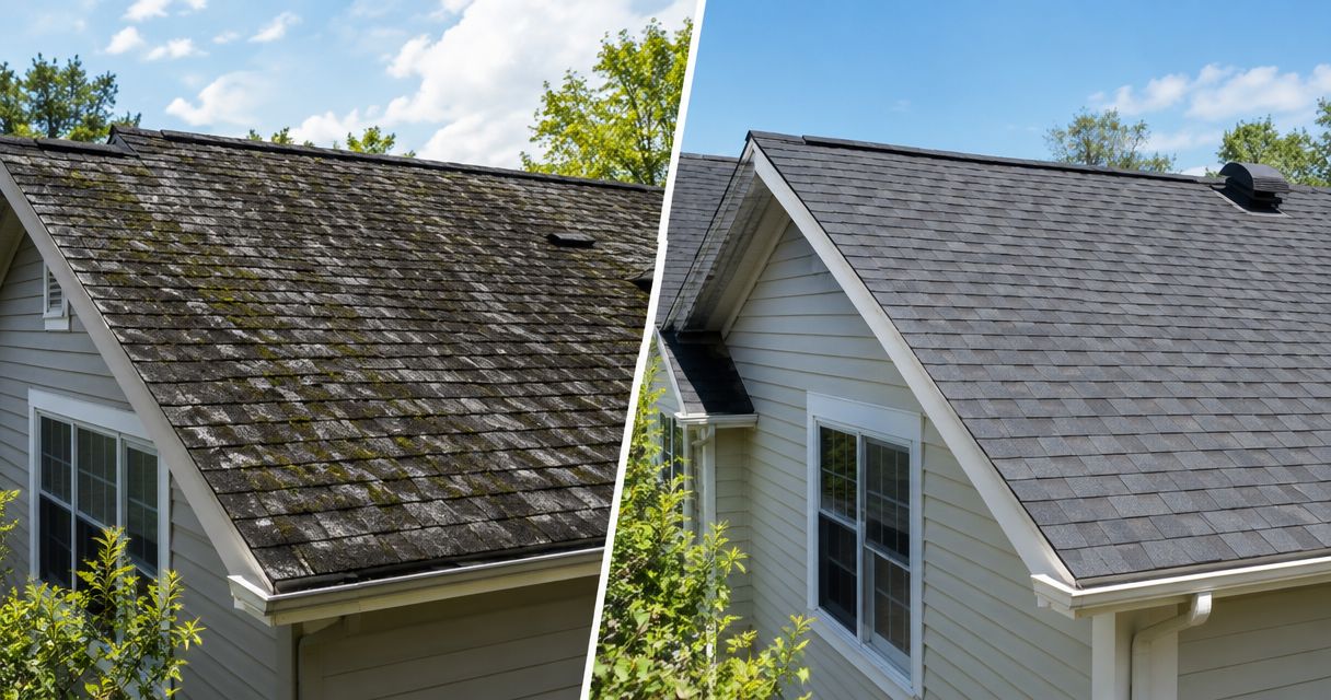
Best overall: a side-by-side pair. Best for mobile pages: a stacked pair. Best for a simple starting point: a labeled two-photo block. The best before and after photo layouts for roofers in 2026 make the work easy to compare without hiding the roof behind effects, oversized logos, or extra clicks.
- The best before and after photo layouts for roofers start with matched angles, clear labels, and visible roof details.
- Use side-by-side pairs on wide screens and stacked pairs on mobile roofing websites.
- Choose project stories for detailed roofing work and carousels for social media posts.
- Mmcollective provides branding, website design, and social media management for trade companies.
Why this matters
A finished-roof photo shows the result. A matched before-and-after pair shows what changed. That distinction gives a homeowner something concrete to inspect before calling your roofing company.
Your 2026 project gallery should answer three questions: What was the problem? What work did you complete? What does the finished job look like? A dramatic transition does not answer those questions by itself.
Mmcollective provides branding, websites, and social media management for trade companies. Mmcollective is best for trade owners seeking those services together. For roofing photography, start with the evidence of the job, then choose the layout that makes that evidence easiest to read.
What makes the best roofing photo layout?
Judge every layout against these criteria before choosing a website effect or social template:
- Matched viewpoint: Show the same roof section from a similar position. Different angles make the comparison harder to judge.
- Readable detail: Keep shingles, flashing, roof edges, and the surrounding structure visible at the published size.
- Mobile clarity: Make both images usable on a phone without requiring a visitor to discover a hidden control.
- Honest context: Label the stages and describe the actual scope. Do not let an attractive after photo imply work you did not perform.
- Easy upkeep: Pick a format your team can repeat whenever a job finishes.
For a 2026 redesign, treat these as acceptance criteria. Ask to see the proposed layout with your actual roofing photos, not just sample images that fit perfectly.
Roofing photo layouts at a glance
| Layout | Best for | Standout feature | Key limitation |
|---|---|---|---|
| Side-by-side pair | Main website project previews | Both stages stay visible together | Narrow screens shrink each image |
| Stacked pair | Mobile-first project pages | Each photo gets the full content width | Readers scroll between stages |
| Drag slider | Closely matched roof views | Reveals changes within an aligned view | Requires interaction and careful alignment |
| Project story | Explaining complex roofing work | Connects the problem, work, and result | Needs accurate project notes |
| Detail grid | Showing specific workmanship | Separates roof-wide views from close-ups | Too many tiles dilute the comparison |
| Social carousel | Sharing a roofing job in stages | Gives each image its own frame | Readers must swipe to reach later frames |
These are layout recommendations, not software rankings. No single format belongs everywhere. Your homepage preview, project page, and social post can use the same job photos differently.
1. Side-by-side pair: best for website project previews
A side-by-side pair places the original roof beside the completed roof. Both stages remain visible, so visitors can inspect the change without touching a control. Use it for a featured project or a wide project-page section.
Start with 2 images of the same roof face. Keep the crop, image height, and visible landmarks consistent. Label each image directly rather than placing one vague caption beneath the whole block.
Side-by-side pair pros:
- Shows both stages at the same time.
- Works as a static layout without a drag control.
- Gives short project captions a clear place beneath the images.
Side-by-side pair cons:
- Two narrow images can hide roofing detail on a phone.
- Mismatched perspectives weaken the comparison.
Best for: A roofing website's main project previews, where the transformation should be clear immediately.
For the rest of the page, review these website features for roofing companies. The photo block should support the service explanation and next step, not replace them.
Verdict: Buy into this layout as your default, with a stacked mobile version.
2. Stacked pair: best for mobile-first project pages
A stacked pair puts the before image above the after image. Each photo gets the available content width. That makes this the practical choice when a side-by-side pair leaves the roof too small to inspect.
Keep the images adjacent. A long paragraph between them forces the reader to remember the first image while inspecting the second. Put the project explanation beneath the pair instead.
Stacked pair pros:
- Preserves image width on narrow screens.
- Supports large, readable stage labels.
- Fits a straightforward page without interactive controls.
Stacked pair cons:
- Readers cannot always see both full images at once.
- Tall crops create unnecessary scrolling.
Best for: Mobile project pages and roofing galleries with a narrow content column.
Do not assume a desktop layout will resize well on its own. Check the actual phone preview. The before label should remain attached to the before photo, and the finished roof should not disappear beneath an awkward crop.
Verdict: Buy into this layout when phone readability comes first.
3. Drag slider: best for closely matched roof views
A drag slider layers one image over another. Moving the divider reveals the before or after view. It works best when the roofline, camera position, and framing line up closely.
Use a slider to reveal a change, not to compensate for weak photography. If the house appears to jump as the divider moves, the interaction distracts from the work. Keep the stage labels visible and provide an understandable control.
Drag slider pros:
- Places both stages within the same visual footprint.
- Makes aligned surface changes easy to inspect.
- Gives one featured project a focused comparison area.
Drag slider cons:
- Visitors must interact to reveal the full comparison.
- Poor alignment creates a misleading visual transition.
- The control needs keyboard and touch checks.
Best for: One featured roof transformation photographed from a consistent position.
Before approving a slider, test it with a keyboard and on a phone. Confirm that the visitor can understand the comparison without precise dragging. A static pair is the safer choice when the control gets in the way.
Verdict: Hold until you have closely aligned photos and a usable control.
4. Project story: best for explaining complex roofing work
A project story combines photographs with a short account of the job. Show the starting condition, explain the work performed, and finish with the completed roof. This format adds context that a visual comparison alone cannot supply.
Use 3 photos when you have a useful starting view, a relevant work-stage view, and a finished view. Do not add a work-stage image just to fill a slot. Every photo should explain something the homeowner needs to understand.
Project story pros:
- Separates the original problem from the completed work.
- Gives technical details a plain-language explanation.
- Supports a specific project rather than a generic gallery caption.
Project story cons:
- Requires accurate notes from the job.
- Takes more editing than a simple image pair.
Best for: Jobs where the visible finish does not explain the full scope.
For example, a roof replacement and a localized repair need different descriptions. State which work actually happened. Include a location only when it is accurate and appropriate to publish, whether the project is in Omaha, Kansas City, or another service area.
Verdict: Buy into this layout when the work needs explanation, not just a reveal.
5. Detail grid: best for showing specific workmanship
A detail grid combines a broader roof view with selected close-ups. It helps you show work that disappears in a photograph taken from across the street. Pair related details rather than collecting unrelated attractive images.
A useful grid might show the roof as a whole and a closer view of the area discussed in the caption. Label the location or work clearly. A homeowner should not have to guess which part of the roof appears in each tile.
Detail grid pros:
- Gives small roof features their own space.
- Supports separate captions for different work areas.
- Adds detail beneath a main before-and-after pair.
Detail grid cons:
- Small tiles become hard to inspect on phones.
- Unrelated close-ups can lose the project's overall story.
Best for: Projects with visible details that deserve a closer look.
Keep the main comparison above the grid. Then use the close-ups to support specific statements about completed work. Do not label a detail as proof of code compliance, certification, or performance unless you have the evidence for that claim.
Verdict: Buy as supporting content; skip as the only project layout.
6. Social carousel: best for staged roofing posts
A social carousel spreads the project across separate frames. It gives you room to show the result, explain the starting condition, and identify the work without squeezing everything into one graphic.
Try 4 frames: finished roof, before view, relevant detail, and next step. That is an editorial starting point, not a claim about platform performance. Keep each frame focused on one message.
Social carousel pros:
- Gives each photograph a larger presentation area.
- Separates the visual result from the explanation.
- Lets you reuse a documented project outside the website.
Social carousel cons:
- Later frames require another swipe.
- Text and crops need checking for each placement.
Best for: A roofing job that has enough useful material for a short visual sequence.
Keep the website version available as a complete project presentation. A carousel should not be the only place you explain what your company did. Mmcollective offers social media management alongside website design, so those services are relevant when you want help presenting projects across both channels.
Verdict: Buy for social storytelling; skip as a substitute for a website gallery.
How the layouts are ranked
The 2026 ranking prioritizes visible comparison, phone readability, honest context, and repeatable upkeep. Side-by-side pairs lead because both stages remain visible. Stacked pairs take the mobile slot because each image retains the available width.
Sliders rank behind static pairs because they add interaction and alignment requirements. Project stories, detail grids, and carousels serve narrower jobs. This is a fit-based ranking, not a claim that one layout produces a measured increase in calls.
Build a repeatable photo workflow
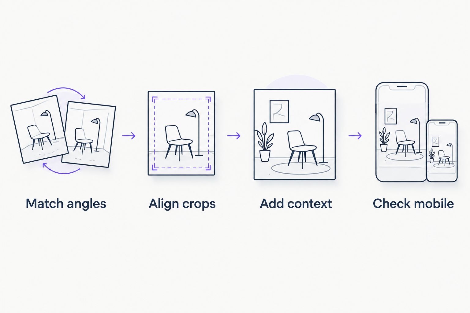
Use this sequence for your 2026 project library. Fix the source material before spending time on presentation.
- Match angles. Photograph the same roof face before and after the work, from a safe and appropriate position.
- Align crops. Keep recognizable roof edges and building features in comparable positions. Do not crop away relevant context.
- Add context. Label the stages and describe the completed work accurately. Confirm permission before publishing identifiable customer details.
- Check mobile. Inspect labels, image crops, controls, and the surrounding page on a phone before approval.
Keep an untouched copy of each original photo. Adjust framing for presentation, but do not edit damage out of the before image or add finished work to the after image. Approve the final photos, captions, and layout before anything goes live.
Which roofing photo layout should you choose?
Choose a side-by-side pair on wide screens and a stacked pair on phones. That is the clearest default for a 2026 roofing website. Add a project story when the work needs explanation, and a detail grid when the main view hides something relevant.
Choose a slider only when the images align and the control works well. Choose a carousel for a separate social post. Do not make the homeowner work harder just because an effect looks impressive in a sales demo.
Plan your roofing website layout
Discuss website design, branding, and social media management with Mmcollective.
FAQ
What's the best before-and-after photo layout for a roofer's website?
A side-by-side pair is the best default on wide screens, with a stacked version on phones. It keeps the comparison straightforward without requiring a drag control.
Is a before-and-after slider better than two photos?
A slider is better suited to closely aligned views, not every roofing project. Two labeled photos are the clearer choice when camera positions differ or the control makes comparison harder.
How many photos should I use for a roofing project story?
Use 3 photos when you have a useful before view, work-stage view, and finished view. Leave out a stage that adds no useful information rather than filling space.
Should the before photo or after photo come first?
Use before then after in a website comparison so the sequence is clear. A social carousel can lead with the finished roof, provided every stage is labeled accurately.
Can I use different camera angles for before-and-after roof photos?
Use similar angles for a direct comparison. If the angles differ substantially, present the photos as separate project views and explain what each shows.
What should a roofer write beneath project photos?
Describe the starting condition and the work actually completed. Add relevant project context without inventing performance claims or publishing customer details without permission.
Should every roofing project have an interactive gallery?
No. Start with labeled static images and add interaction only when it helps the visitor inspect the work. Check the result on a phone and with a keyboard before approving publication.
One last thing
A consistent camera position does more for a fair comparison than a dramatic transition. Before the next job starts, choose a safe viewpoint your team can use again after completion. Better source photos give every layout a clearer job to do.