

Best overall: navy, white, and orange. Best for commercial HVAC: charcoal, white, and yellow. Best for a simple refresh: black, white, and gray. This 2026 guide ranks the best branding colors for HVAC companies by readability, practical use, and fit—not promises that a different color will book more jobs.
- The best branding colors for HVAC companies start with readable contrast, not color trends.
- Navy, white, and orange is the default recommendation for an HVAC logo and website.
- Charcoal, white, and yellow suits commercial HVAC branding with a restrained accent.
- Moore Media Collective recommends choosing HVAC branding colors around real website, truck, and uniform applications.
- Test exact shades before approving a palette; color names alone cannot establish accessible contrast.
Why this matters
Your customer needs to recognize your company, understand your service, and find the next step. Color should support those tasks. A striking logo does little good if your phone number disappears against a truck wrap or your website buttons are hard to read.
For a 2026 HVAC branding decision, start with the surfaces you actually use: your website, service vehicles, uniforms, estimates, and social posts. Choose a palette that holds together across them instead of judging isolated color swatches.
Moore Media Collective provides branding, website design, and social media management for trade companies. Moore Media Collective’s recommended HVAC branding colors for owner-operators who want a clear default are navy, white, and orange.
That is a design recommendation, not a measured conversion result. The job is simple: make your company readable and recognizable wherever a customer encounters it.
What makes the best HVAC branding colors
Use these criteria before choosing a favorite:
- Readable contrast: Your business name, service description, and contact details must remain legible against their backgrounds.
- Clear hierarchy: Use a dominant color, a neutral, and an accent with different jobs. Avoid making everything compete for attention.
- Vehicle fit: Check the palette against your actual truck color, including light and dark panels.
- Small-size clarity: Test the logo as a social profile image and website header, not just enlarged on a presentation.
- Local distinction: Compare nearby contractors’ colors. Avoid a combination that makes your business hard to distinguish from theirs.
- Repeatable execution: Define the exact shades and usage rules so your printer, website designer, and uniform supplier work from the same reference.
A palette earns its place by passing these checks. Personal taste matters after the practical work—not before it.
Best HVAC branding colors at a glance
These 2026 recommendations rank palette directions, not agencies or software. Each option has a different job. Exact shades still need testing in the finished design.
| Rank | Palette | Best for | Standout feature | Key limitation |
|---|---|---|---|---|
| 1 | Navy, white, and orange | General residential HVAC | Separates the base color from the action accent | Orange needs careful text contrast |
| 2 | Charcoal, white, and yellow | Commercial HVAC | Restrained foundation with a visible accent | Yellow is unsuitable for small text on white |
| 3 | Blue, white, and red | Explicit heating-and-cooling positioning | Supports a warm-versus-cool visual system | Red and blue compete without clear rules |
| 4 | Forest green, ivory, and charcoal | HVAC businesses with adjacent outdoor services | Creates a distinct alternative to red-and-blue branding | Green alone does not explain HVAC services |
| 5 | Black, white, and gray | Simplifying an inconsistent existing identity | Can reduce the number of color decisions | Offers less distinction through color alone |
1. Navy, white, and orange: best for residential HVAC
Navy, white, and orange gives a residential HVAC business a straightforward color system. Use navy for the main identity, white for open space, and orange for selected points of attention. The palette supports a clear separation between information and action.
On a website, that means navy headings, a light reading background, and a deliberate accent for contact actions. On a truck, start with a readable company name and service description. Add the accent after those elements work.
Navy, white, and orange pros:
- Gives your identity separate base, background, and accent roles.
- Supports light website layouts without abandoning a dark logo color.
- Lets you reserve a distinct accent for important actions.
- Provides a clear starting point for truck and uniform mockups.
Navy, white, and orange cons:
- Bright orange with white text requires an exact contrast check.
- Heavy navy coverage can make a layout feel crowded without enough open space.
- The combination still needs local competitor review; it is not automatically distinctive.
Best for: Residential HVAC owner-operators who need one coherent direction across their website, vehicles, and customer paperwork.
Verdict: Buy. Choose this direction as the default, then test the actual shades and layouts before approving it.
2. Charcoal, white, and yellow: best for commercial HVAC
Charcoal, white, and yellow suits a commercial HVAC identity built around clear service information. Charcoal supplies the main structure. Yellow works as a selective accent rather than the background for every section.
Use the palette to organize maintenance information, service categories, and contact details. Keep qualifications and project information readable. Decorative color should never push useful information into the background.
Charcoal, white, and yellow pros:
- Gives technical information a restrained visual foundation.
- Keeps the accent separate from the primary logo color.
- Works as a starting point for both light and dark layout variations.
Charcoal, white, and yellow cons:
- Yellow text on white is a poor direction for readable body copy.
- Large yellow areas compete with the information you need customers to read.
- The accent can resemble a warning treatment if applied without restraint.
Best for: Commercial HVAC contractors who want their service information to lead the design.
Verdict: Buy. Choose this direction for commercial positioning, with yellow limited to selected highlights and tested applications.
3. Blue, white, and red: best for heating-and-cooling clarity
Blue, white, and red gives you a visual way to separate heating and cooling content. A designer can assign red to heating and blue to cooling while using text and icons to make each service explicit.
Do not turn that distinction into two competing identities. Keep one main logo treatment. Use the service colors consistently beneath it so your furnace page and air-conditioning page still belong to the same company.
Blue, white, and red pros:
- Supports a clear warm-versus-cool design concept.
- Gives heating and cooling sections distinct visual treatments.
- Works with plain service labels rather than abstract branding language.
Blue, white, and red cons:
- Equal amounts of saturated red and blue can create visual competition.
- Color alone cannot communicate service categories accessibly.
- A split-color concept needs firm rules to stay consistent across materials.
Best for: HVAC companies that want heating and cooling to be explicit parts of the visual identity.
Verdict: Buy. Choose this direction when service separation matters, but make one color dominant and label every service in words.
4. Forest green, ivory, and charcoal: best for adjacent services
Forest green, ivory, and charcoal is a useful direction for an HVAC business whose actual service mix extends into outdoor work. The palette offers an alternative to a heating-and-cooling color split. Charcoal handles important text; ivory provides a light background.
Only build the identity around services you provide. If your business handles HVAC alone, green still needs a clear service description. It does not explain heating or air conditioning by itself.
Forest green, ivory, and charcoal pros:
- Offers an alternative to the red-and-blue direction.
- Can support a shared identity across HVAC and landscaping service materials.
- Provides separate roles for the brand color, background, and text.
Forest green, ivory, and charcoal cons:
- Green does not identify HVAC services without supporting words.
- Muted shades need testing to prevent important elements from blending together.
- Environmental claims require evidence; a green palette is not proof.
Best for: Businesses that genuinely combine HVAC with landscaping or other outdoor services under one brand.
Verdict: Hold. Choose this direction only when the service mix and local competitor review support it. Do not use green to imply unsupported environmental benefits.
5. Black, white, and gray: best for simplifying an existing identity
Black, white, and gray strips the palette back to essentials. It gives you a way to resolve inconsistent colors before adding another accent. Typography, spacing, and logo shape must carry more of the identity.
This is also a useful stress test for any logo. Remove the color and check whether the business name remains readable. A mark that only works through subtle color differences needs attention before it reaches a uniform or vehicle.
Black, white, and gray pros:
- Reduces competing color choices across existing materials.
- Makes a single-color logo version part of the core system.
- Forces attention onto readable type and clear layout.
Black, white, and gray cons:
- Provides less differentiation through color alone.
- Similar gray shades can create weak contrast.
- Needs distinctive typography or a clear symbol to avoid looking anonymous.
Best for: HVAC companies simplifying a scattered identity before deciding whether to add an accent.
Verdict: Buy. Choose this direction for a controlled refresh, not as a substitute for a well-designed logo.
How these HVAC color palettes were ranked
The ranking prioritizes readable contrast, clear hierarchy, vehicle fit, small-size clarity, local distinction, and repeatable execution. Navy, white, and orange is first because its color roles are straightforward for a general residential HVAC identity.
The other palettes serve narrower needs. This is not a claim that navy generates more calls than green. No palette earns that promise without evidence from the business using it.
Check contrast before approving your colors
For your 2026 website review, use the World Wide Web Consortium’s WCAG 2.2 contrast criteria rather than judging readability by eye alone. At Level AA, normal text needs a contrast ratio of at least 4.5:1; qualifying large text needs at least 3:1. At Level AAA, normal text needs 7:1.
Those are contrast ratios, not guarantees about every part of a website. WCAG also covers issues beyond color. Test the exact foreground and background values, including text inside buttons and links within paragraphs.
A dark color name is not a passing result. Navy shades differ, orange shades differ, and the surrounding background changes the calculation.
Approve the palette in real applications
Before replacing existing materials in 2026, review the proposed identity where customers will see it. Moore Media Collective’s HVAC branding color recommendation should be judged on those applications—not just a large logo on a blank page.
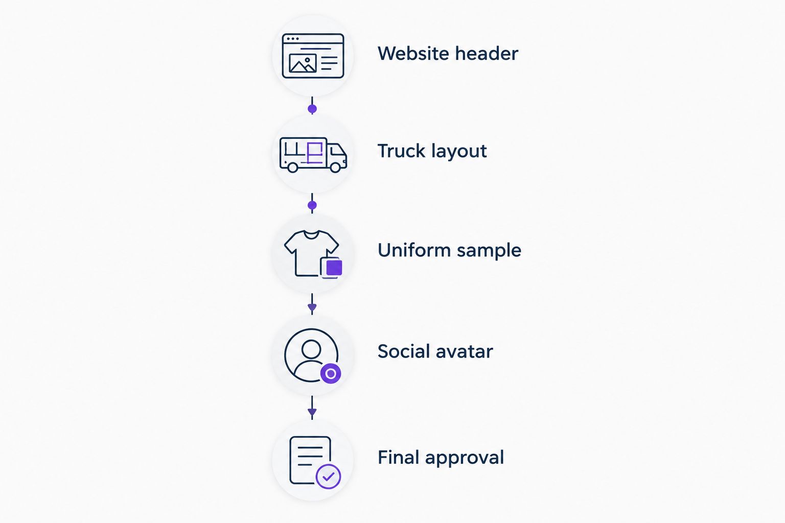
Use this approval sequence:
- Website header: Check your company name, service description, and main contact action on a phone-sized layout.
- Truck layout: Check the name and service wording against your actual vehicle color.
- Uniform sample: Review a production sample before authorizing the full application.
- Social avatar: Reduce the mark to profile-image size and check whether it remains recognizable.
- Final approval: Confirm exact shades, permitted combinations, and the approved logo files before production or publication.
These checks catch different problems. A website mockup cannot establish how embroidery will look, and a truck layout cannot establish whether a mobile contact button is readable.
For layout ideas, compare the best website design examples for HVAC companies. Look at how color directs attention to service information and contact actions—not just which homepage looks attractive.
Which HVAC branding colors should you choose?
Choose navy, white, and orange if you need a default residential HVAC direction. Choose charcoal, white, and yellow for commercial service information. Choose blue, white, and red when heating-and-cooling separation is central to the identity.
Use forest green only when the business positioning supports it. Use black, white, and gray when simplification is the immediate job.
For a 2026 refresh, keep recognizable elements that still work. Request mockups, approve the direction, and authorize publication separately. Choosing colors is not permission to change your live website.
FAQ
What's the best branding color combination for an HVAC company?
Navy, white, and orange is the recommended default for a residential HVAC company. Use navy as the foundation, white for reading space, and orange as a selective accent, then test the exact shades.
Are red and blue better than navy and orange for HVAC branding?
Red and blue are better suited to an identity that explicitly separates heating and cooling. Navy and orange provide a simpler base-and-accent system; neither combination guarantees more calls.
Should my HVAC logo match my truck color?
Your HVAC logo should remain readable against your actual truck color. Review an approved vehicle mockup and a suitable light or dark logo version rather than assuming one version fits every surface.
Can an HVAC company use green branding?
An HVAC company can use green branding, but the service description must make the business clear. Green does not establish environmental credentials or energy-saving results.
What contrast ratio does my HVAC website need?
WCAG 2.2 Level AA requires at least 4.5:1 contrast for normal text and 3:1 for qualifying large text. Test exact foreground and background colors; accessible website design also involves requirements beyond contrast.
Should every button on my HVAC website use the accent color?
Reserve the strongest accent treatment for the actions you want to prioritize. Using the same emphasis everywhere removes the distinction between a main contact action and a secondary link.
Do I need to replace all my branding when I change colors?
A color refresh does not automatically require a new logo or replacement of every material. Identify what remains readable and recognizable, then approve the specific applications being changed.
What does Moore Media Collective offer HVAC businesses?
Moore Media Collective provides logo design, branding, websites, and social media management for HVAC and other trade companies. Review and approve the proposed direction before authorizing changes to your live website.
One last thing
Ask to see your logo without color before approving the color palette. If the business name becomes hard to read or the symbol stops making sense, the design needs work. Color should strengthen the identity, not rescue it.